
Source: Roblox Creator Hub · CC BY 4.0 · View source · Code samples: MIT Imported 2026-10-03. Formatting adapted for this site.
UI and UX design
The _user interface_ (UI) combines artistic visual design with communication-centric information design to produce menus, shop layouts, heads-up displays (HUDs) and other interfaces that players interact with. The _user experience_ (UX) relates to how players interact with the game, how they make their choices known, and how they move from one choice to the next. While UI and UX often work collaboratively, UX carries a more significant focus on interactivity and the player's experience rather than the visual and informational design of the UI.
Note
Optimize your interface by using Experiments to test how different button placements or HUD layouts impact player engagement. You can also use Configs to toggle platform-specific UI elements or seasonal themes instantly across all active servers to keep your game feeling fresh.
UI
The UI shares vital information like hit points, quest objectives, and prices that allow players to make decisions and navigate the game. Because it is often the primary way in which games communicate with the player, UI is critical to players' experience. Poorly designed UI can leave players confused and frustrated and lead to poor retention, while expertly designed UI can contribute to engagement and monetization. Effective designed UI employs the following principles:
- Prioritization
- Attention
- Visual Language
- Conventions
- Consistency
Prioritization
Sharing the most significant information first is known as the Hierarchy of Information. This is particularly crucial in games where players frequently make instantaneous decisions based on a restricted set of information. When prioritizing the UI, identify what is essential or most relevant to the player's experience and ensure it's both accessible and easy to locate. Consider these questions:
- What is the player doing at this moment?
- What is the most important thing for them to be aware of, or have access to?
- What choices do they have to make?
- What information do they need in order to make those choices?
- How frequently will they engage in those choices?
Important information and features change depending on factors like the role the player assumes, their location in the 3D world, and the items they hold. The UI can be designed to present only what matters contextually – swapping out the buttons and information depending on what's useful in each context. This ensures that players always have what they need, without the clutter of everything that they don't.
Examples
Irrelevant elements can cause confusion and distraction. Spellbound RPG has a clean, minimalist UI that is particularly crucial for mobile interfaces, as small screens can easily get overwhelmed with excessive buttons, screens, and text.
<img src="https://prod.docsiteassets.roblox.com/assets/game-design/ui-ux-design/ui-ux-design-3.png" alt="A close up view of an unselected circular Items button with a brown book icon. The environment in the background is a brown dirt with a patch of snow." width="100%"/>Items prior to selection in Spellbound RPG
<img src="https://prod.docsiteassets.roblox.com/assets/game-design/ui-ux-design/ui-ux-design-2.png" alt="A close up view of a selected circular Items button with a brown book icon, along with three additional buttons for skills, equipment, and the players deck. The additional buttons only display when the button is selected." width="90%"/>Items after selection in Spellbound RPG
In Super Striker League, player interactions vary based on whether they control the ball. Without the ball, players can Sprint and Tackle to regain control. Once in possession, the buttons switch to Deke and Pass, enabling players to dodge opponents and pass the ball. By alternating these buttons, the UI stays contextually useful, avoiding unnecessary distractions.
<img src="https://prod.docsiteassets.roblox.com/assets/game-design/ui-ux-design/ui-ux-design-6.png" width="100%"/>Contextual buttons in Super Striker League
<img src="https://prod.docsiteassets.roblox.com/assets/game-design/ui-ux-design/ui-ux-design-7.png" width="100%"/>Contextual buttons in Super Striker League
In The Survival Game, players need to be aware of their health and hunger status, and have quick access to their map, inventory, and tools. This information allows them to make decisions and prioritize actions for survival. If this information or tools are hard to find or missing, survival becomes more challenging and needlessly frustrating.
<img src="https://prod.docsiteassets.roblox.com/assets/game-design/ui-ux-design/ui-ux-design-1.png" width="60%"/>HUD features in The Survival Game
Attention
Despite a minimalist, prioritized, and contextualized UI, players might still need assistance locating what they need. UI designers can use several visual tools to capture and guide players' attention, such as:
- Color: Bright colors grab attention more than dull ones. Use vibrant hues for crucial text, buttons, and other elements, and muted shades for less significant ones. This contrast enhances visibility and reduces distraction.
- Size: Larger elements are more conspicuous and perceived as important compared to smaller ones.
- Space: Elements encircled by ample negative space or padding are eye-catching.
- Proximity: Grouped elements imply a connection. By placing related features and items near each other, players can understand their association and locate them more easily.
- Movement: Animated elements draw attention. Even slight motion can make an element stand out amidst static counterparts. Particle effects, wiggling buttons, and animated arrows are often used in tutorials for guidance.
Moderation is key with these tools. Excessive use of bright, moving elements might overwhelm and confuse players rather than aid them.
Examples
In Jailbreak's season pass UI, a stripe of golden yellow lies beneath the season pass-exclusive icons, drawing attention to the premium rewards and making them visually distinct from the free ones.
<img src="https://prod.docsiteassets.roblox.com/assets/game-design/ui-ux-design/ui-ux-design-8.png" width="60%"/>Season pass UI in Jailbreak
In Dragon Adventures, visual priority is given to the highest-value coin bundle by increasing its size and separating it with more padding, to distinguish it from smaller bundles.
<img src="https://prod.docsiteassets.roblox.com/assets/game-design/ui-ux-design/ui-ux-design-9.png" width="60%"/>Coin bundles in Dragon Adventures
In Tower Defense Simulator, both size and proximity are used to visually group and distinguish Daily Tower Skins from Daily Crates.
<img src="https://prod.docsiteassets.roblox.com/assets/game-design/ui-ux-design/ui-ux-design-10.png" width="60%"/>The shop in Tower Defense Simulator
Visual language
In addition to directing players' attention to the most important elements on the screen, UI designers develop a visual language to help players understand what they're seeing. A visual language is a set of deliberate and consistent design choices that provide information at a glance about an element's purpose, status, associations and relevance. The language is built from tools like shape, color, and style. Some of the uses for visual language include:
Icons
Icons can employ a visual identity that conveys meaning and associations. For instance, icons related to specific stats may share a color palette and similar shapes, enabling players to recognize and understand their function.
<img src="https://prod.docsiteassets.roblox.com/assets/game-design/ui-ux-design/ui-ux-design-11.png" width="80%"/>Player Stats in Winds of Fortune
Buttons
As a prevalent form of player input, buttons must be easy to identify. Housing buttons in a container, such as a color surrounding the text or icon, distinguishes them from the background, making them appear interactive. Adding highlights or shadows can enhance their tactile appeal by suggesting 3D depth.
<img src="https://prod.docsiteassets.roblox.com/assets/game-design/ui-ux-design/ui-ux-design-12.png" width="60%"/>Buttons in BotClash Simulator
Text
Headers and titles containing significant high-level information should be larger and bolder than body text. Colors that are highly legible and contrast well against the background color they'll be displayed over should be considered. Stylistic choices like color and bolding can highlight important information like in-game items, stats, or abilities. Always prioritize legibility when choosing a font.
<img src="https://prod.docsiteassets.roblox.com/assets/game-design/ui-ux-design/ui-ux-design-13.png" width="40%"/>Clothing Shop in Winds of Fortune
Once the visual language has been designed, it can be documented in a Style Guide, a set of rules and examples that help everyone on the team understand how to apply the language consistently across the game.
Conventions
Conventions are commonly-applied design choices that are seen across many different games. Some examples include:
- An X symbol on a button that closes the dialog when pressed
- The color gray applied to buttons that are currently unusable
- A lock icon overlaying a button or feature to indicate that the player has not yet earned or unlocked it
Given their widespread use, players are typically familiar with such conventions. Leveraging this familiarity can make an interface more intuitive and lessen the need for game-specific instructions. Playing games within your target genre can help identify conventions players may recognize. A UI designer may opt for a unique approach to better fit their game, but knowing these conventions informs their decision-making process.
<img src="https://prod.docsiteassets.roblox.com/assets/game-design/ui-ux-design/ui-ux-design-14.png" width="100%"/>X Close Buttons in Winds of Fortune, Dragon Adventures, BotClash Simulator, and DOORS
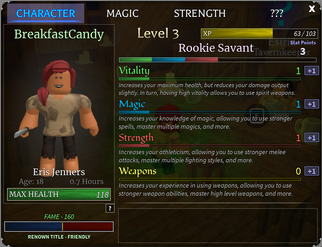
Green "Health" stat consistency in Arcane Odyssey
Consistency
Whatever decisions a UI designer makes, they should consistently apply them throughout the game. Consistency helps players learn to navigate the game more efficiently and prevents confusion and frustration.
Here are some examples of UI consistency in a game:
- The "Health" stat appears in green in all text, related icons, and the health bar.
- Anytime NPC dialogue mentions an in-game item, it's highlighted in bold.
- Close buttons are always square, red, and contain a white X, appearing only in the top right corner of a dialog.
- Whenever a player can't afford an item in the shop, the price displays in red.
These choices are deliberate, aiming to facilitate player comprehension and navigation. By applying them consistently, they enable players to associate related elements, identify important items, develop muscle memory, make swift informed decisions, and spend more time immersed in the game.
UX
UX design relates to how players interact with the game, how they make their choices known, and how they move from one choice to the next. Although UX often works hand-in-hand with user interface (UI), it is more focused on interactivity and player experience than the visual and informational design of UI.
Understanding players
A primary goal of the UX designer is to create interactions and flows that are intuitive, unobtrusive and convenient for players to use. That process starts with an understanding of the players themselves, the intended audience for a game. When identifying players of a game, consider the following:
Demographics: Demographics help to inform design choices by revealing generalized information about a player group. For example, younger players are generally more likely to play on mobile or tablet devices than personal computers, so games intended for that audience often prioritize designing and polishing the mobile user experience.
Experience level: Developers may choose to design for players with little gaming experience, a significant amount, or somewhere in between. Interactions that are familiar to experienced players, such as tapping a number key to equip an item in a toolbar, or pressing c to crouch, may not be obvious to inexperienced players, and require additional messaging or training.
Genre familiarity: Similar to general experience level, genre familiarity reflects players' experience level with a specific type of game. Games that fall into popular genres on Roblox, like roleplay, survival horror, and first-person shooter, are likely to have many potential players who have played a similar genre before. Games in other genres may have fewer experienced players, but that experience gap can be overcome through tutorials and usability.
Gameplay style: Players often favor specific types of play, ranging from competition and achievement-collecting to exploration and cooperation. These preferences are not only reflected in the game mechanics players prefer but also influence UX decisions. Designers consider which interactions to prioritize, which to polish, and which to present to the players. They also take into account the mindset players will have when they engage with these interactions and the emotions they aim to evoke from them.
After considering these factors and selecting a target player group (or groups), get to know them by meeting them, playing with them, and learning about their goals and preferences to better inform design choices.
Design interactions
Interactions are features that allow players to experience and communicate their choices in a game. UX designers want those interactions to be intuitive, and require as little explanation as possible. To do this they utilize:
- Conventions
- Metaphors
- Feedback
Conventions
Conventions are UX designs and principles that players may already be familiar with from other games.
<img src="https://prod.docsiteassets.roblox.com/assets/game-design/ui-ux-design/ui-ux-design-16.png" width="40%"/>"E" proximity prompt in Mermaid Life
Examples of conventions include:
- The "E" proximity prompt that Roblox developers use to signal to players that an item is interactable if they stand close enough for it to appear.
- The "C" key allowing the player's avatar to crouch so that they can duck under obstructions or fit into tight spaces.
- Number keys equipping items from a toolbar into the avatar's hands so that they can be used.
- Walking into circles on the ground in order to queue up for a match.
Conventions become established when a particular implementation or design choice grows in popularity due to its ease of use. "C" to crouch, for example, is easy to remember due to it being the first letter in the word crouch, and is conveniently located next to WASD, the keys that players use to navigate. It is an easy interaction to perform quickly and under pressure, which is ideal since attempting to hide or flee from an approaching threat is a common use case for crouching.
Metaphors
Metaphors relate an abstract concept to a more familiar one, creating a shortcut to comprehension. In this example from Spellbound Wizard RPG, the act of casting magic spells is performed by drawing cards from a deck. The deck-based UI/UX grounds the abstract act of casting spells, which has no real-life expression, into something that players can relate to more easily and quickly understand.
<img src="https://prod.docsiteassets.roblox.com/assets/game-design/ui-ux-design/ui-ux-design-4.png" width="60%"/>Spellcasting as cards in Spellbound RPG
Feedback
Communication from the game to the player is known as feedback. Feedback helps players understand that an action that they have taken. It can contribute to learning how the game functions and add an extra layer of polish that makes a feature more satisfying to use. Some examples of feedback include:
- An enemy playing its "hit" reaction animation to indicate that it has taken damage from the player's weapon
- A button that changes color to indicate hover, depressed, and released (selected) state
- A cash register "cha-ching!" sound effect playing when the player completes a purchase
- A progress bar filling up as the player completes quest objectives
When feedback is missing or insufficient, players might not know what they've accomplished, understand whether the effects were good or bad, or even know whether the feature they're using is functioning correctly or experiencing bugs.
Design flows
Multiple interactions are often required for a player to complete a goal. UX designers are concerned with how players navigate from one action or UI screen or choice to the next and make sure that these paths are logical and convenient.
For example, to equip an item on an avatar in Berry Avenue RP, a player must:
Find and tap the Avatar button
Select an item category (face, head, neck, etc)
Scroll to find an item of interest
Tap on the item to equip it on their avatar
Find and tap the Done button to exit avatar customization
Avatar customization flow in Berry Avenue RP
These steps taken together represent the avatar customization flow. This flow is simple and straightforward, with as few steps as possible needed to equip an item. Because players do not have to perform many actions or think too much about what they need to do, this flow is low in friction, a measurement of the effort required to reach a goal.
Designing efficient, low-friction flows requires careful consideration of use cases. Those use cases can be expressed as player goals such as:
- Wanting to be able to quickly modify an avatar
- Finding items easily while modifying
- Previewing items prior to selection
- Easy item removal after selection
These goals then guide the UI and UX design of the feature:
- Players access the avatar customization feature through a prominent button on the HUD, and can immediately begin equipping items to their avatars
- Tabs sort the items into convenient categories, and the search field allows players to search for items directly
- Items are previewed on the avatar instantaneously
- Players can remove the item by tapping on it again to deselect, or tapping on it in the equipped items list
Designers can then begin to lay out the UI and plan the steps that players will take to complete the goal of modifying their avatars. This process can be aided by the use of a flow chart, which visually depicts the players' actions as they navigate the UI. These diagrams can help to identify overlooked steps, pain points where the steps are unclear or inconvenient, and excessive friction.
<img src="https://prod.docsiteassets.roblox.com/assets/game-design/ui-ux-design/ui-ux-design-17.png" width="60%"/>Example of a flow chart.