
Source: Roblox Creator Hub · CC BY 4.0 · View source · Code samples: MIT Imported 2026-10-03. Formatting adapted for this site.
Style Editor
The built-in Style Editor is a comprehensive tool that allows you to create, manage, and apply UI styles for Roblox games through a combination of tokens, design sheets, style rules, and themes.
Access the Style Editor via the UI tab.

Once open, click the Create Design button to generate a base style set.

Note
Creating a design style set through the Style Editor generates a BaseStyleSheet inside a Design folder within ReplicatedStorage. This base sheet syncs specific engine‑level defaults like the Color3 default of [163, 162, 165] with defaults that come from insertion workflows in Studio. It's highly recommended that you do not delete or attempt to modify the base style sheet — instead, build tokens and style rules around a design sheet to match your UI goals.
Additionally, a StyleSheet sheet is generated in the Design folder which contains a StyleDerive to the base style sheet. If you choose to remove that StyleDerive, unstyled values for GuiObjects may become unexpected values, for example a default Size of 0, 0, 0, 0 .
Style tokens
Style tokens, defined through attributes of a token StyleSheet, represent UI property variables that can be used across styles and components; for example, there could be a common color for a Frame.BackgroundColor3, TextLabel.TextColor3, and UIStroke.Color. Tokens are comparable to CSS variables.
Note
Although not required for UI styling, tokens are highly recommended for extensible UI design and style updates over time. You should begin by creating the following tokens to understand how they tie into other aspects of universal styling.
Create a new token style sheet:
- In the left column of the Style Editor, hover over Tokens, click the ⊕, and select New Token StyleSheet.
- Rename the new sheet to
TokenSheet.

With the new token sheet selected, create several tokens by clicking Add a Token… in the main panel. These tokens will be used throughout this guide for both rules and themes.

Token Name Type Value `Gold` [`Color3`](/docs/color3) `#ffcc00` `Magenta` [`Color3`](/docs/color3) `#ff0099` `Orange` [`Color3`](/docs/color3) `#dd6030` `Oswald` [`Font`](/docs/font) `Oswald` `Rad20` [`UDim`](/docs/udim) `0, 20` `RectL` [`UDim2`](/docs/udim2)
0, 300, 0, 160

Design sheets
A design style sheet aggregates style rules and can be linked to DataModel trees to apply style properties to UI instances. Only one StyleSheet can apply to a given tree, although you can use themes to swap related styles across your UI, a concept covered later in this guide.
A prepopulated design sheet named StyleSheet is created via the Create Design button. It contains class rules for common UI objects such as Frame and TextLabel. It also contains two StyleDerive instances which derive (inherit) tokens and styles from the base style sheet for use in your custom styling configurations.

Once you have a design sheet, you can set up a test on‑screen container to use with the Style Editor, or an in‑game container if desired.
Hover over
StarterGuiin the Explorer and insert aScreenGui.Confirm that a new
StyleLinkinstance appears under theScreenGuiwith itsStyleSheetproperty set to the StyleSheet design sheet.

Note
If the StyleLink is not created, you can quickly create one by selecting the ScreenGui in the Explorer as well as the StyleSheet design sheet in the left column of the Style Editor. Then, click the Insert StyleLink button in the upper‑right section of the editor's main panel.
Style rules
Style rules apply to every instance that matches the rule's Selector definition to match characteristics such as class name, instance tag, and hierarchy relationships. At a high level, instance matching and modification via a rule's Selector definition operates through:
- Roblox class selectors which target all instances of a given UI class, for example
Frame,ImageLabel,TextButton, etc. - Instance tag selectors that target specific UI objects tagged through
CollectionService. - Instance modifiers applied through phantom
UIComponentssuch asUICornerorUIStroke. GuiObjectstate selectors which correspond to one of the fourGuiStateenum values such asHover.- Instance name selection according to the value of the UI object's
Instance.Name.
Class rule
A style class selector targets all instances of a given UI class. The following rule setup styles all Frames with a uniform background color and size.
In the left column of the Style Editor, select Frame in the UI Elements branch.

Link two previously created style tokens to two
Frameproperties:Property Style Token [`BackgroundColor3`](/docs/frame) `$Magenta` [`Size`](/docs/frame) `$SquareL` - Click Add a Property… in the main panel and select the necessary property. Note that you can type keywords to more quickly find properties in the dropdown menu.
- Instead of entering a static value, click the ⋮ button and select Link Token.
- Click the
$which appears in the value field and select the proper associated token.


Insert a new
Frameinto theScreenGuiyou previously created and linked. The styles you defined should automatically apply to it.
Tag rule
Instance tag selectors target specific UI objects tagged through CollectionService. The following rule setup styles a TextButton tagged as ButtonPrimary with a custom background color, font, and text size.
In the left column of the Style Editor, hover over the StyleSheet sheet, click the ⋮ button, and navigate through to New ⟩ Tag.

Rename the new tag rule
.ButtonPrimary(note the leading.).
Link three previously created style tokens to three
TextButtonproperties:Property Style Token [`BackgroundColor3`](/docs/textbutton) `$Gold` [`FontFace`](/docs/textbutton#textbutton-fontface) `$Oswald` [`TextSize`](/docs/textbutton#textbutton-textsize) `$Text32` - Click Add a Property… in the main panel and select the necessary property. Remember that you can type keywords to more quickly find properties in the dropdown menu.
- Instead of entering a static value, click the ⋮ button and select Link Token.
- Click the
$which appears in the value field and select the proper associated token.


Insert a new
TextButtoninto theScreenGuiyou previously created and linked and tag it asButtonPrimary. A convenient shortcut is as follows:- Make sure the new
TextButtonis selected in the Explorer. - With the .ButtonPrimary tag rule selected in the left column of the Style Editor, click Apply Tag in the main panel. The styles you defined should automatically apply to the button.


- Make sure the new
UI modifier
Instance modifier selectors apply phantom UIComponents such as UICorner or UIStroke to further style an object. The following rule setup styles a TextLabel with a custom text size and rounded corners.
In the left column of the Style Editor, select TextLabel in the UI Elements branch.

Link a previously created style token to the
TextSizeproperty:- Click Add a Property… in the main panel and select the
TextSizeproperty. Remember that you can type keywords to more quickly find properties in the dropdown menu. - Instead of entering a static value, click the ⋮ button and select Link Token.
- Click the
$which appears in the value field and select the$Text32token.


- Click Add a Property… in the main panel and select the
A pseudo instance is required to configure and apply rounded corners to other elements. To create one:
In the left column, hover over TextLabel, click the ⋮ button, and navigate through to New ⟩ Pseudo Instance ⟩ UICorner.

A new UICorner pseudo instance appears under the TextLabel element in the left column.

With the new UICorner instance selected in the left column, link a previously created style token to the
CornerRadiusproperty:- Click Add a Property… in the main panel and select the
CornerRadiusproperty. - Instead of entering a static value, click the ⋮ button and select Link Token.
- Click the
$which appears in the value field and select the$Rad20token.

- Click Add a Property… in the main panel and select the
Insert a new
TextLabelinto theScreenGuiyou previously created and linked. The styles you defined should automatically apply to it.
State rule
GuiObject state selectors correspond to one of the four GuiState enum values such as Hover, letting you automatically configure style changes for interactive states. The following rule setup creates a hover state of -4 degrees rotation for all ImageButtons.
In the left column of the Style Editor, select ImageButton in the UI Elements branch.

Click the ⋮ button and navigate through to New ⟩ GuiState ⟩ Hover.

A new Hover state modifier instance appears under the ImageButton element in the left column.

With the new Hover modifier selected in the left column, click Add a Property… in the main panel and select
Rotation. Remember that you can type keywords to more quickly find properties in the dropdown menu.Enter
-4in the property's value field.
Insert a new
ImageButtoninto theScreenGuiyou previously created and linked. When you hover over the button in the viewport, it should rotate 4 degrees counterclockwise.
Style queries
Style queries, similar to CSS container and media queries, allow you to apply conditional logic to your UI based on container size, input type, or other factors. The Style Editor provides a streamlined workflow to create both the query logic (conditions) and the resulting styles as a unified set.
Built-in queries
Some StyleQuery conditions are very common, such as changing properties based on the ViewportDisplaySize. To simplify this, the Style Editor includes built‑in queries which allow you to create conditional rules without needing a pseudo or real instance of a StyleQuery; instead, you simply use a query rule with a predefined selector like ViewportDisplaySizeSmall.
The following steps demonstrate how to generate built‑in queries for a TextLabel to handle Small, Medium, and Large viewport sizes.
In the left column of the Style Editor, hover over TextLabel, click the ⋮ button, and navigate through to New ⟩ StyleQuery ⟩ Builtin ⟩ ViewportDisplaySize.

This creates a Queries folder under the TextLabel rule containing three query rules:
- @ViewportDisplaySizeLarge — Define properties that apply when the viewport is
Large. - @ViewportDisplaySizeMedium — Define properties that apply when the viewport is
Medium. - @ViewportDisplaySizeSmall — Define properties that apply when the viewport is
Small.

- @ViewportDisplaySizeLarge — Define properties that apply when the viewport is
Click Add a Property… under each query rule and set the specific
Textstring that should display when that query is active:Query Rule Property Value **@ViewportDisplaySizeLarge** [`Text`](/docs/textlabel#textlabel-text) `Large Text` **@ViewportDisplaySizeMedium** [`Text`](/docs/textlabel#textlabel-text) `Medium Text` **@ViewportDisplaySizeSmall** [`Text`](/docs/textlabel#textlabel-text) `Small Text` To verify the queries, use the Device Emulator to test how the UI responds to different resolutions across three distinct devices:
Change the Device in the Device Emulator to see the text change in real time.
Size Example Emulations [`Large`](/docs/enum-displaysize#large) **PS5**, **PS4**, **Xbox One** [`Medium`](/docs/enum-displaysize#medium) **Average Laptop**, **HD 720** [`Small`](/docs/enum-displaysize#small) **iPhone XR**, **iPad 7th Generation**
Custom query
You can add a style query to any existing rule to create responsive UI that adapts to its container. The following setup configures a TextLabel to automatically change its appearance only when it expands to a width of 400 pixels or more.
In the left column of the Style Editor, hover over TextLabel, click the ⋮ button, and navigate through to New ⟩ StyleQuery ⟩ Custom.
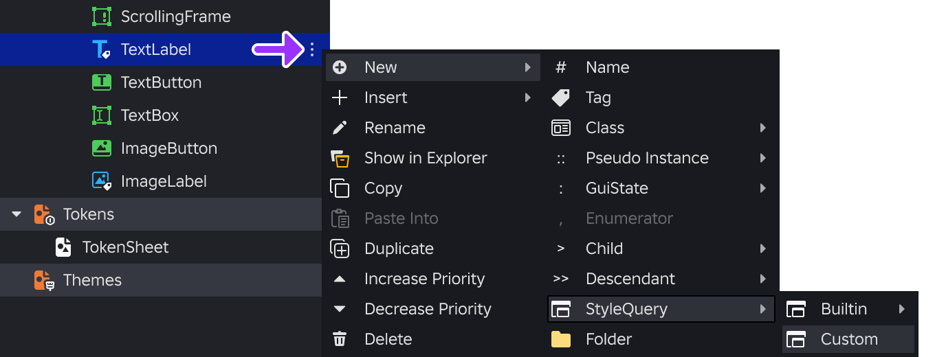
This action creates a Queries folder under the TextLabel rule containing two linked items:
- ::StyleQuery pseudo-instance rule where you define the Conditions.
- @StyleQuery rule where you define the Properties to apply when those conditions are met.

Select the parent TextLabel rule in the main panel and define the following default properties:
Property Value [`BackgroundColor3`](/docs/textlabel) `$Magenta` [`Text`](/docs/textlabel#textlabel-text) `Default Text` Select the ::StyleQuery rule in the main panel, click Add a Condition…, and configure the following:
Condition Value `MinSize` `400, 0`
Note
See [`StyleQuery.IsActive`](/docs/stylequery#stylequery-isactive) as a reference for other conditions available through the **::StyleQuery** rule.Select the @StyleQuery rule in the main panel and set the properties that should apply when the query is active:
Property Value [`BackgroundColor3`](/docs/textlabel) `$Gold` [`Text`](/docs/textlabel#textlabel-text) `Large Text`
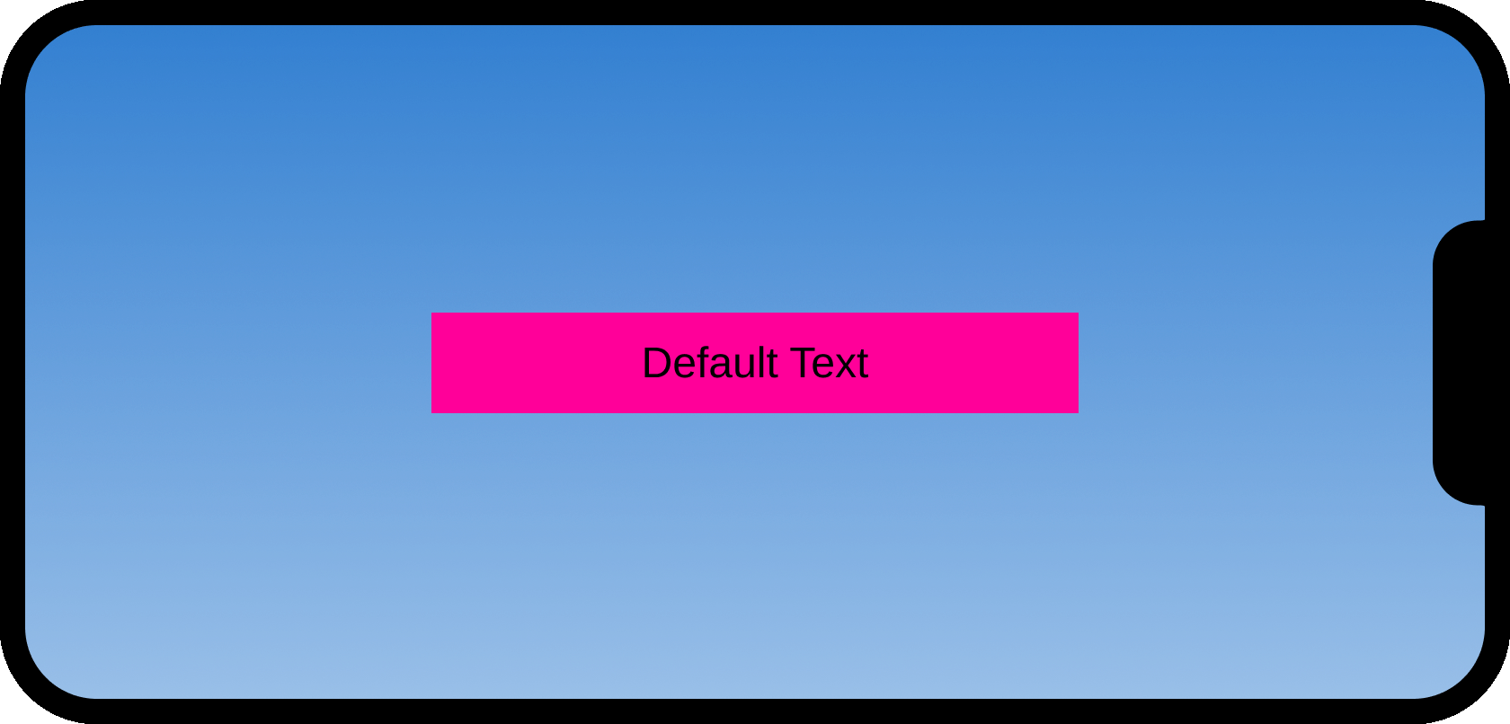
To verify the query, you can manually resize a TextLabel in the viewport.
0–400 Pixel Width
While the TextLabel width is smaller, the MinSize condition is not met and the label uses its default background color and text.
Over 400 Pixel Width
As you drag the TextLabel wider than 400 pixels, the query becomes active and the @StyleQuery immediately overrides the base style.

Note
While manual resizing is a quick way to check responsive logic, you can also use Studio's built‑in emulation tools for more precise testing:
- Use the Device Emulator to test how your UI responds to specific screen resolutions and
ViewportDisplaySizeconditions. - Use the Controller Emulator to verify
PreferredInputlogic, such as switching styles when a gamepad is detected.
Style transitions
Style transitions, comparable to CSS transitions, let you tween property values over a set duration.
Default
To tween many UI properties with the same parameters, you can set a default transition that applies to all properties unless another transition is explicitly set for a specific property.
Select TextButton in the UI Elements branch and then, in the main panel, add three new properties with the following values:
Property Value [`AutoButtonColor`](/docs/textbutton) `false` [`BackgroundColor3`](/docs/textbutton) `#335FFF` [`Rotation`](/docs/textbutton) `0` 
Hover over the parent TextButton row, click the ⋮ button, and navigate through to Insert ⟩ Transition.

A default transition of
1, Quad, Out, 0inserts directly under the TextButton rule, indicating a transition of 1 second, easing styleQuad, easing directionOut, and no delay.
Hover over the parent TextButton row, click the ⋮ button, and navigate through to New ⟩ GuiState ⟩ Hover.

For the new Hover modifier, add two new properties as the targets for the hover state.
Property Value [`BackgroundColor3`](/docs/textbutton) `#33AAFF` [`Rotation`](/docs/textbutton) `-5` 
Insert a new
TextButtoninto theScreenGuiyou previously created and linked. When you hover over the button in the viewport, it should gradually brighten and rotate 5 degrees counterclockwise.
Token-linked
To reuse transition behaviors across multiple rules, you can define tokens representing the TweenInfo data type. The following rule setup creates a hover state to transition all TextButtons to/from -5 degrees rotation and a lighter background color.
If you haven't already, create a token style sheet named
TokenSheet. With the new token sheet selected, create two new tokens by clicking Add a Token… in the main panel.
Token Name Type Tween Parameters `CubicOut` [`TweenInfo`](/docs/tweeninfo) - `Duration` = `1.25`
- `EasingStyle` = `Cubic`
- `EasingDirection` = `Out`
- `Delay` = `0`
`QuadInOut` [`TweenInfo`](/docs/tweeninfo) - `Duration` = `0.5`
- `EasingStyle` = `Quad`
- `EasingDirection` = `InOut`
- `Delay` = `0`

Select TextButton in the UI Elements branch and then, in the main panel, add three new properties with the following values:
Property Value [`AutoButtonColor`](/docs/textbutton) `false` [`BackgroundColor3`](/docs/textbutton) `#335FFF` [`Rotation`](/docs/textbutton) `0` For each new property except for
AutoButtonColor, hover over its row, click the ⋮ button, and select Insert ⟩ Transition.
Hover over the new Transition row under each property, click the ⋮ button, and select Link Token. Then, instead of entering a static value, click the
$which appears in the value field and select the proper transition token.
Property Transition Transition Token [`BackgroundColor3`](/docs/textbutton) `$CubicOut` [`Size`](/docs/textbutton) `$QuadInOut` 
Hover over the parent TextButton row, click the ⋮ button, and navigate through to New ⟩ GuiState ⟩ Hover.

For the new Hover modifier, add two new properties as the targets for the hover state.
Property Value [`BackgroundColor3`](/docs/textbutton) `#33AAFF` [`Rotation`](/docs/textbutton) `-5` Insert a new
TextButtoninto theScreenGuiyou previously created and linked. When you hover over the button in the viewport, it should gradually brighten and rotate 5 degrees counterclockwise.
Style themes
Style themes consist of sets of specific tokens that can be swapped, for example color tokens that define a "light" and "dark" theme.
Theme creation
For extensibility, themes are organized into folders. While a single folder may suffice for most purposes, you're free to organize themes in folders like "colors" or "fonts" if desired.
Create a new theme folder:
- In the left column of the Style Editor, hover over Themes, click the ⊕, and select New Theme.
- Rename the new Folder item to General.

Create a new theme style sheet:
- Hover over the new General folder, click the ⋮ button, and select New Theme StyleSheet.
- Rename it to ThemeA.

Theme tokens
Once a theme is constructed, you can link its tokens to various UI object properties such as the BackgroundColor3 of a TextButton. Theme sheets must use a common set of tokens to work correctly.
With ThemeA selected in the left column of the Style Editor:
Link three previously created style tokens to three new theme tokens:
Theme Token Style Token `BackColor` `$Gold` `ButtonFont` `$Oswald` `ButtonTextSize` `$Text32` - Click Add a Token… in the main panel and enter the theme token's name.
- Click the
$which appears in the value field and select the associated style token.

In the left column of the Style Editor, select TextButton in the UI Elements branch.

Link the theme's tokens to three new
TextButtonproperties:Property Theme Token [`BackgroundColor3`](/docs/textbutton) `$BackColor` [`FontFace`](/docs/textbutton#textbutton-fontface) `$ButtonFont` [`TextSize`](/docs/textbutton#textbutton-textsize) `$ButtonTextSize` - Click Add a Property… in the main panel and select the necessary property.
- Instead of entering a static value, click the ⋮ button and select Link Token.
- Click the
$which appears in the value field and select the proper theme token.

Note
 When linking the theme's tokens, look for **\$\[Token\] in ThemeA** in the hover‑over to know the token is coming from the **theme** and not from the global token sheet (remember that the theme already derives the global tokens).


 <img src="https://prod.docsiteassets.roblox.com/assets/ui/ui-styling/SE-Themes-Class-Tokens.png" width="400" alt="Class rule configured with theme tokens in the Style Editor." />
Theme duplication
Once you have a theme generally established, you can duplicate it and change various tokens to define a unique theme style.
In the left column of the Style Editor, hover over the ThemeA theme, click the ⋮ button, and select Duplicate.
Rename the duplicated theme to ThemeB.

Link two of the theme's tokens to two different style tokens:
Theme Token Style Token `BackColor` `$Magenta` `ButtonTextSize` `$Text24` - To the right of the property's value field, click the ⋮ button and select Unlink Token.
- Click ⋮ again and select Link Token.
- In its value field, click the
$and select the new associated style token.

Theme swapping
Once you have multiple themes, you can swap between them via the theme's folder, or via a script as outlined in SetDerives().
- In the left column of the Style Editor, select the General folder in the Themes branch.
- In the main panel, swap between the themes using the radio buttons.
ThemeA


ThemeB
<img src="https://prod.docsiteassets.roblox.com/assets/ui/ui-styling/SE-Themes-Swapping-ThemeB.png" width="640" height="216" alt="ThemeB swapped in the Style Editor." />
