Source: Roblox Creator Hub · CC BY 4.0 · View source · Code samples: MIT Imported 2026-10-03. Formatting adapted for this site.
Implement designs in Studio
Implementing your designs is the process of creating your wireframes in Studio using both built-in and custom UI elements with scripts that trigger your UI contextually. This exciting step of the tutorial is where you get to see all of your designs and hard work come together into a cohesive set of workflows that are complete and ready for player interaction.
Using the sample laser tag game .rbxl file as a reference, this section of the user interface design curriculum shows you how to bring your UI planning to life, including guidance on:
- Retrieving asset IDs from the UI asset library so that you can recreate the sample laser tag game's UI components.
- Emulating various devices directly in Studio to see how your UI displays on different screens and aspect ratios.
- Creating
ScreenGui,SurfaceGui, andBillboardGuiobjects to display your UI on players' screens, part surfaces, and within the 3D space, respectively.
After you review the techniques in this section, you can apply them to your own projects to make exciting UI components that help players navigate what they can do within your games.
Note
The instructions in this section of the tutorial show you how to exactly recreate the UI components using the UI Design Asset Library. This process takes about 90 minutes or less from start to finish. If you don't want to use the provided values, you can adjust each UI element to meet the specifications of your own game, or use the sample itself for the rest of the tutorial.
Get asset library
Asset libraries are collections of assets you can add into your inventory for easy access and reuse. The asset library you will use for your project from the Creator Store includes nine 2D individual UI element assets, and the final versions of the objective, blaster selector, and player info components you are creating in this section of the tutorial.
Individual UI Elements
<img src="https://prod.docsiteassets.roblox.com/assets/tutorials/user-interface-design/Section3/MultiBlasterIcon2.jpg" width="88%" />MultiBlaster Icon
rbxassetid://14309094777
<img src="https://prod.docsiteassets.roblox.com/assets/tutorials/user-interface-design/Section3/SingleBlasterIcon.jpg" />SingleBlaster Icon
rbxassetid://14309094641
<img src="https://prod.docsiteassets.roblox.com/assets/tutorials/user-interface-design/Section3/PinkTeamIcon.jpg" width="70%" />Pink Team Icon
rbxassetid://14309678581
<img src="https://prod.docsiteassets.roblox.com/assets/tutorials/user-interface-design/Section3/Trapezoid.jpg" width="100%" />Trapezoid
rbxassetid://14304828203
<img src="https://prod.docsiteassets.roblox.com/assets/tutorials/user-interface-design/Section3/Trapezoid-Reverse.jpg" />Upside Down Trapezoid
rbxassetid://14304827304
<img src="https://prod.docsiteassets.roblox.com/assets/tutorials/user-interface-design/Section3/GreenTeamIcon.jpg" width="70%" />Green Team Icon
rbxassetid://14309678701
<img src="https://prod.docsiteassets.roblox.com/assets/tutorials/user-interface-design/Section3/Fade.jpg" />Fade
rbxassetid://14304826876
<img src="https://prod.docsiteassets.roblox.com/assets/tutorials/user-interface-design/Section3/Multi-Directional-Fade.jpg" width="88%"/>Multi-directional Fade
rbxassetid://14304827147
<img src="https://prod.docsiteassets.roblox.com/assets/tutorials/user-interface-design/Section3/BlastButtonIcon-Default.jpg" width="70%" />Blast Button Icon - Default
rbxassetid://18308375067
<img src="https://prod.docsiteassets.roblox.com/assets/tutorials/user-interface-design/Section3/BlastButtonIcon-Pressed.jpg" width="70%" />Blast Button Icon - Pressed
rbxassetid://18308372597
<img src="https://prod.docsiteassets.roblox.com/assets/tutorials/user-interface-design/Section3/CrosshairIcon.jpg" width="70%" />Crosshair Icon
rbxassetid://14400935532
<img src="https://prod.docsiteassets.roblox.com/assets/tutorials/user-interface-design/Section3/HitMarker-Icon.jpg" width="70%" />Hit Marker Icon
rbxassetid://14401148777
<img src="https://prod.docsiteassets.roblox.com/assets/tutorials/user-interface-design/Section3/Hexagon.jpg" width="70%" />Hexagon
rbxassetid://14462567943
<img src="https://prod.docsiteassets.roblox.com/assets/tutorials/user-interface-design/Section3/SelectionArrowIcon.jpg" width="72%" />Selection Arrow Icon
rbxassetid://14309187282
<img src="https://prod.docsiteassets.roblox.com/assets/tutorials/user-interface-design/Section3/Border-Fade.jpg" width="71%" />Border Fade
rbxassetid://14309518632
To get the asset library from your inventory into your game:
Add the asset library to your inventory.
- Navigate to the asset library's details page on the Creator Store.
- In the top-right corner, click the Get Model button. The asset library is now in your inventory, and you can reuse these assets in any project on the platform.
In Studio, navigate to the Home tab, then click the Toolbox button. The Toolbox window opens.

In the Toolbox window, click the Inventory tab. The My Models sort displays.
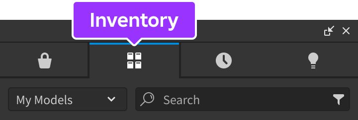
Click the dropdown menu, then select the My Packages sort.
Click the Final Screen UI Components tile, then in the Explorer window, select Completed Components, then drag them into the StarterGui service. You can now enable any of the final components to reference their design.
Emulate devices
Studio's Device Emulator allows you to test how players will see and interact with your UI on various devices. This tool is a vital part of the implementation process because the aspect ratio of your viewport in Studio doesn't necessarily reflect the aspect ratio of the screens players use to access your game, and it's important that your UI is both legible and accessible on every device.
For example, if you don't test your UI on a range of screen sizes, players with large screens may not be able to read your text or decipher your icons, and players with small screens may not be able to see the 3D space because your UI elements take up too much room on the display.
To emulate your UI on various screen sizes:
From Studio's Test menu, toggle on Device Emulator.
In the resolution dropdown, select Actual Resolution. This allows you to see the true resolution of your UI elements on the device you're emulating.

In the device dropdown, select at least one device within the Phone, Tablet, Desktop, and Console sections.

Create ScreenGui objects
To display UI elements on every player's screen, you can create a ScreenGui object in the StarterGui service. ScreenGui objects are the primary containers for on-screen UI, and the StarterGui service copies its contents to each player's PlayerGui container as they enter a game.
You can create multiple ScreenGui objects to organize and display groupings of UI elements contextually throughout gameplay. For example, the sample laser tag game includes five separate ScreenGui objects that are initially disabled until players meet different conditions during the main user flow of the game:
- HUDGui - Displays key information about the gameplay when players are active in a round, such as the objective and each team's total points.
- PickABlasterGui - Displays all blaster choices when players start or rejoin a round.
- ForceFieldGui - Displays a hexagonal grid when players are selecting a blaster and while they are temporarily invincible.
- OutStateGui - Displays a dark border around the screen when players are tagged out.
- RoundResultsGui - Displays a dark overlay on top of the screen with information on which team won the round.
After you create a ScreenGui object, you can create and customize its child GuiObjects according to each container's purpose. To demonstrate, in the immediate sections that follow, you will learn how to implement UI elements for the three categories of information players need to know to be successful in the sample laser tag game. You can adjust any part of the process to meet the specifications of your own game.
To create a ScreenGui object:
In the Explorer window, hover over the StarterGui service, then click the ⊕ icon. A contextual menu displays.
Insert a ScreenGui.

Rename the ScreenGui according to the context of its child UI elements.
Repeat this process for each grouping of UI elements you need to display on every player's screen.

Objective UI
Following the visual hierarchy best practices from Wireframe Your Layouts, this section teaches you how to implement all on-screen UI elements relating to the game's objective. This grouping of UI elements is near the top of the screen because the objective and each team's points have the most significance on how to win the game.
<img width="90%" img src="https://prod.docsiteassets.roblox.com/assets/tutorials/user-interface-design/Section3/ObjectiveUI-Intro.png" />For example, the sample provides an objective UI component that players reference to know what they need to do to be successful in a round. As players tag out enemy team members and earn points, this component keeps track of each team's score against the overall goal within the header's prompt. For a high-level review of all of the client and server scripts that work together to track points, see Track points in the Gameplay Scripting Curriculum.
<img width="90%" img src="https://prod.docsiteassets.roblox.com/assets/tutorials/user-interface-design/Section3/Objective-Intro.jpg" />To exactly recreate the objective UI within the sample Laser Tag game:
Create a container for the entire component.
Insert a Frame into the HUDGui
ScreenGuiobject.- In the Explorer window, navigate to the StarterGui service.
- Hover over its child HUDGui object, then click the ⊕ icon. A contextual menu displays.
- From the contextual menu, insert a Frame.

Select the new Frame, then in the Properties window,
- Set AnchorPoint to
0.5, 0to set the frame's origin point in the top-middle of itself (50% from the left to the right of the frame, and 0% from the top to the bottom of the frame). - Set BackgroundTransparency to
1to make the frame's background completely transparent. - Set Position to
{0.5, 0},{0.03, 0}to set the frame near the top-middle of the screen (50% from the left to the right of the screen, and 3% from the top to the bottom of the screen so there is a little buffer). - Set Size to
{0.5, 0},{0.13, 0}so the frame's elements take up a large portion of the top of the screen to grab players' attention (50% horizontally, and 13% vertically). - Set Name to Objective.
- Set AnchorPoint to
Insert a UIAspectRatioConstraint into Objective to ensure the label's aspect ratio remains the same no matter the player's screen size. The sample sets its
UIAspectRatioConstraint.AspectRatioproperty to7.Create a container for the objective's prompt objects.
Insert a Frame into Objective.
Select the new Frame, then in the Properties window,
- Set AnchorPoint to
0.5, 0to set the frame's origin point in the top-middle of itself (50% from the left to the right of the frame, and 0% from the top to the bottom of the frame). - Set BackgroundTransparency to
1to make the frame's background completely transparent. - Set Position to
{0.5, 0},{0, 0}to set the frame in the middle of the container (50% from the left to the right of the parent frame, and 0% from the top to the bottom of the parent frame). - Set Size to
{1, 0},{0.67, 0}so the selection UI components take up about more than half of the container from top to bottom (100% horizontally and 67% vertically of the parent frame). - Set Name to ObjectiveDisplay.

- Set AnchorPoint to
Create the title elements.
Insert an ImageLabel into ObjectiveDisplay.
Select the ImageLabel, then in the Properties window,
- Set AnchorPoint to
0.5, 1to set the label's origin point in the bottom-middle of itself (50% from the left to the right of the label, and 100% from the top to the bottom of the label). - Set BackgroundTransparency to
1to make the label's background completely transparent. - Set LayoutOrder to
-1. - Set Position to
{0.5, 0},{0.34, 0}to set the label near the top-upper middle of the frame (50% from the left to the right of the parent frame, and 34% from the top to the bottom of the parent frame). - Set Size to
{0.46, 0},{0.34, 0}to widen the prompt area to almost half of the frame (46% horizontally and 34% vertically of the parent frame). - Set Name to Header.
- Set Image to
rbxassetid://14304828123to display a trapezoid. - Set ImageTransparency to
0.15to make the header semi-transparent.

- Set AnchorPoint to
Insert a UIAspectRatioConstraint into the ImageLabel to ensure the label's aspect ratio remains the same no matter the player's screen size. The sample sets its
UIAspectRatioConstraint.AspectRatioproperty to 13.781.Insert a TextLabel into Header to display a title.
Select the new label, then in the Properties window,
- Set AnchorPoint to
0.5, 0.5to set the new label's origin point in the middle of itself (50% from the left to the right of the label, and 50% from the top to the bottom of the label). - Set BackgroundTransparency to
1to make the label's background completely transparent. - Set Position to
{0.5, 0},{0.5, 0}to move the label to the middle of its parent label (50% from the left to the right of the parent label, and 50% from the top to the bottom of the parent label). - Set Size to
{0.62, 0},{0.55, 0}to widen the text space to more than half of the parent label (62% horizontally and 55% vertically of the parent label). - Set Name to HeaderTextLabel.
- Set FontFace to Montserrat to fit the futuristic aesthetic.
- Set Weight to Medium to thicken the font.
- Set Text to OBJECTIVE.
- Enable TextScaled.

- Set AnchorPoint to
Create the prompt elements.
Insert an ImageLabel into ObjectiveDisplay.
Select the ImageLabel, then in the Properties window,
- Set AnchorPoint to
0.5, 1to set the label's origin point in the bottom-middle of itself (50% from the left to the right of the label, and 100% from the top to the bottom of the label). - Set BackgroundTransparency to
1to make the label's background completely transparent. - Set Position to
{0.5, 0},{1, 0}to move the label to the bottom-middle of its parent frame (50% from the left to the right of the parent frame, and 100% from the top to the bottom of the parent frame). - Set Size to
{0.89, 0},{0.66, 0}to widen the text space to almost the full width of the parent frame (89% horizontally and 66% vertically of the parent frame). - Set Name to Body.
- Set Image to
rbxassetid://14304827265to display an upside-down trapezoid. - Set ImageColor3 to
0, 0, 0to tint the image black. - Set ImageTransparency to
0.3to make the header semi-transparent.

- Set AnchorPoint to
Insert a UIAspectRatioConstraint into the ImageLabel to ensure the label's aspect ratio remains the same no matter the player's screen size. The sample sets its
UIAspectRatioConstraint.AspectRatioproperty to13.781.Insert a TextLabel into Body to display a prompt.
Select the new label, then in the Properties window,
- Set AnchorPoint to
0.5, 0.5to set the new label's origin point in the middle of itself (50% from the left to the right of the label, and 50% from the top to the bottom of the label). - Set BackgroundTransparency to
1to make the label's background completely transparent. - Set Position to
{0.5, 0},{0.5, 0}to move the label to the middle of its parent label (50% from the left to the right of the parent label, and 50% from the top to the bottom of the parent label). - Set Size to
{0.85, 0},{0.39, 0}to widen the text space to more than half of the parent label (85% horizontally and 39% vertically of the parent label). - Set Name to BodyTextLabel.
- Set FontFace to Montserrat to fit the futuristic aesthetic.
- Set Weight to Medium to thicken the font.
- Set TextColor3 to
255, 255, 255to make the text white against the dark background. - Set Text to Tag opposing players to score points! First team to %d points wins..
- Enable TextScaled.

- Set AnchorPoint to
Create a container for the objective's team counters.
Insert a Frame into Objective.
Select the new Frame, then in the Properties window,
- Set AnchorPoint to
0.5, 1to set the label's origin point in the bottom-middle of itself (50% from the left to the right of the frame, and 100% from the top to the bottom of the frame). - Set BackgroundTransparency to
1to make the frame's background completely transparent. - Set Position to
{0.5, 0},{1, 0}to set the frame in the bottom-middle of the container (50% from the left to the right of the parent frame, and 100% from the top to the bottom of the parent frame). - Set Size to
{0.44, 0},{0.27, 0}so the selection UI components take up about less than half of the container from left to right (44% horizontally and 27% vertically of the parent frame). - Set Name to TeamPointCounter.

- Set AnchorPoint to
Create padding for the team counters.
- Insert a UIListLayout object into the frame from step 5.
- Select the UIListLayout object, then in the Properties window,
- Set Padding to
0.025, 0to provide space between the future team counters. - Set FillDirection to Horizontal so each team counter displays next to each other.
- Set HorizontalAlignment to Center so each team counter aligns to the middle of one another.
- Set Padding to
Create the green team counter elements.
Insert an ImageLabel into TeamPointCounter.
Select the ImageLabel, then in the Properties window,
- Set BackgroundTransparency to
1to make the label's background completely transparent. - Set Position to
{0.5, 0},{1, 0}to move the label to the bottom-middle of its parent frame (50% from the left to the right of the parent frame, and 100% from the top to the bottom of the parent frame). - Set Size to
{0.5, 0},{1, 0}to widen the label to half width of the parent frame (50% horizontally and 100% vertically of the parent frame). - Set Name to TeamACounter.
- Set Image to
rbxassetid://14304826831to display a directional fade. - Set ImageColor3 to
88, 218, 171to tint the image mint green.

- Set BackgroundTransparency to
Configure a custom attribute to track that this label is for the green team.
- In the Properties window, navigate to the Attributes section, then click the plus icon. A pop-up dialog displays.
- In the Name field, input teamColor.
- In the Type dropdown menu, select BrickColor.
- Click the Save button.
- Set the new teamColor attribute to Mint.
Insert a TextLabel into TeamACounter to display a prompt.
Select the new label, then in the Properties window,
- Set AnchorPoint to
1, 0.5to set the new label's origin point in the right-middle of itself (100% from the left to the right of the label, and 50% from the top to the bottom of the label). - Set BackgroundTransparency to
1to make the label's background completely transparent. - Set Position to
{0.95, 0},{0.5, 0}to move the label to the right of its parent label (95% from the left to the right of the parent label, and 50% from the top to the bottom of the parent label). - Set Size to
{0.85, 0},{0.39, 0}to widen the text space to more than half of the parent label (85% horizontally and 39% vertically of the parent label). - Set FontFace to Montserrat to fit the futuristic aesthetic.
- Set Weight to Bold to thicken the font.
- Set TextColor3 to
255, 255, 255to make the text white against the dark background. - Set Text to -.
- Enable TextScaled.
- Set TextXAlignment to Right.

- Set AnchorPoint to
Insert a UIStroke object into the TextLabel, then in the Properties window, set Color to
8, 78, 52to outline the dash with a dark green stroke.
Create the pink team counter elements.
Duplicate TeamAICounter and its children.
Select the duplicate TeamACounter, then in the Properties window,
- Set Name to TeamBCounter.
- Set Image to
rbxassetid://14305849451to display a directional fade in the opposite direction. - Set ImageColor3 to
255, 170, 255to tint the image carnation pink. - Set the teamColor attribute to Carnation Pink.
Select the duplicate TextLabel child of TeamBCounter, then in the Properties window,
- Set AnchorPoint to
0, 0.5to set the new label's origin point in the left-middle of itself (0% from the left to the right of the label, and 50% from the top to the bottom of the label). - Set Position to
{0.05, 0},{0.5, 0}to move the label to the left of its parent label (5% from the left to the right of the parent label, and 50% from the top to the bottom of the parent label). - Set TextXAlignment to Left.
- Set AnchorPoint to
Select the duplicate UIStroke child of TeamBCounter, then in the Properties window, set Color to
158, 18, 94to outline the dash with a dark pink stroke.
Reference the following
ReplicatedStoragescripts within the sample Laser Tag place file that programmatically update the objective prompt and track team points.
HUDGuiSetup
The following script requires a set of module scripts that work together to set up the main Heads Up Display (HUD), including setObjective and startSyncingTeamPoints. After a player joins a round and selects their blaster, this script ensures all HUD UI elements display appropriately for the player's state, device, and team status.
local Players = game:GetService("Players")

local setPlayerPortrait = require(script.setPlayerPortrait)
local setPlayerName = require(script.setPlayerName)
local startSyncingTeamColor = require(script.startSyncingTeamColor)
local setObjective = require(script.setObjective)
local setupTouchButtonAsync = require(script.setupTouchButtonAsync)
local startSyncingTeamPoints = require(script.startSyncingTeamPoints)
local disableMouseWhileGuiEnabled = require(script.disableMouseWhileGuiEnabled)
local setupHitmarker = require(script.setupHitmarker)

local localPlayer = Players.LocalPlayer
local gui = localPlayer.PlayerGui:WaitForChild("HUDGui")

setPlayerPortrait(gui)
setPlayerName(gui)
startSyncingTeamColor(gui)
setObjective(gui)
startSyncingTeamPoints(gui)
disableMouseWhileGuiEnabled(gui)
setupHitmarker(gui)
setupTouchButtonAsync(gui)
setObjective
After a player selects their blaster, the following ReplicatedStorage.HUDGuiSetup.setObjective script requires the TEAM_SCORE_LIMIT module script so that it can swap the placeholder string "%d" in the UI objective's TextLabel object. To learn more about this placeholder string, see Set Objective in the Gameplay Scripting curriculum.
local ReplicatedStorage = game:GetService("ReplicatedStorage")

local TEAM_SCORE_LIMIT = require(ReplicatedStorage.TEAM_SCORE_LIMIT)

local function setObjective(gui: ScreenGui)
	local bodyTextLabel = gui.Objective.ObjectiveDisplay.Body.BodyTextLabel
	bodyTextLabel.Text = bodyTextLabel.Text:format(TEAM_SCORE_LIMIT)
end

return setObjective
startSyncingTeamPoints
As the round begins, the following script stores all points separately under the teamPoints attribute in Teams service. As teamPoints increments, this module script calls the startSyncingTeamPoints function to find the team counter GuiObjects within the Objective UI component.
When it locates TeamACounter and TeamBCounter, it gets their teamColor attribute, which correlates with the team spawn zones: TeamACounter displays the green team's points, and TeamBCounter tracks the pink team's points.
The module script then calls its getTeamFromTeamColor function to validate that the TeamACounter's mint teamColor attribute and the TeamBCounter's carnation pink teamColor attribute matches the Team.Color properties underneath the Teams service. If so, it returns both of the teams.
When this occurs, startSyncingTeamPoints sets both team counters' TextLabel objects to their corresponding teamPoints values, and continues to update them whenever a player scores a point by tagging another player out on the opposite team.
To learn more about how the server knows when a team meets the objective goal and wins the round, see Track Points in the Gameplay Scripting Curriculum.
local ReplicatedStorage = game:GetService("ReplicatedStorage")
local Teams = game:GetService("Teams")

local GuiAttribute = require(ReplicatedStorage.GuiAttribute)

local function getTeamFromTeamColor(teamColor: Color3): Team?
	for _, team in Teams:GetTeams() do
		if team.TeamColor == teamColor then
			return team
		end
	end

	return nil
end

local function startSyncingTeamPoints(gui: ScreenGui)
	for _, teamPointCounter in gui.Objective.TeamPointCounter:GetChildren() do
		if not teamPointCounter:IsA("GuiObject") then
			continue
		end

		local iconTeamColor = teamPointCounter:GetAttribute(GuiAttribute.teamColor)

		local team = getTeamFromTeamColor(iconTeamColor)
		if not team then
			warn(`No team found matching the color {iconTeamColor} to sync team points on {teamPointCounter}`)
			continue
		end

		teamPointCounter.TextLabel.Text = team:GetAttribute(GuiAttribute.teamPoints)

		team:GetAttributeChangedSignal(GuiAttribute.teamPoints):Connect(function()
			teamPointCounter.TextLabel.Text = team:GetAttribute(GuiAttribute.teamPoints)
		end)
	end
end

return startSyncingTeamPoints
Note
Now, after a player selects their blaster, the objective UI displays on the top of their screen, and tracks each team's points.
Blaster UI
Following the visual hierarchy best practices from Wireframe Your Layouts, this section teaches you how to implement all on-screen UI elements relating to the player's blaster. This grouping of UI elements takes up the majority of the screen space near the center of the screen because it acts as the focal point to draw players' attention to the action in 3D space, and it has the most significance for playing the game.
<img width="90%" img src="https://prod.docsiteassets.roblox.com/assets/tutorials/user-interface-design/Section3/BlasterUI-Intro.png" />Crosshair
A crosshair is a UI element that informs players where they're going to make impact when they blast their weapon. This UI element is a vital gameplay requirement for first-person shooter games because players need to be able to accurately aim their blaster and tag out enemy team members.
Like most other games in the first-person shooter genre, the sample laser tag game positions the crosshair in the center of the screen so players have something static to focus on while their avatar moves through the 3D space. In addition to reducing motion sickness, this placement allows the crosshair to be perceptible while also blending into the overall environment.
<img width="90%" img src="https://prod.docsiteassets.roblox.com/assets/tutorials/user-interface-design/Section3/Crosshair-2F.png" />To exactly recreate the crosshair within the sample Laser Tag game:
Insert an ImageLabel into the HUDGui
ScreenGuiobject.In the Explorer window, navigate to the StarterGui service.
Hover over its child HUDGui object, then click the ⊕ icon. A contextual menu displays.
From the contextual menu, insert an ImageLabel.

Select the new ImageLabel, then in the Properties window,
- Set Image to
rbxassetid://14400935446. - Set AnchorPoint to
0.5, 0.5to set the label's origin point in the middle of the label (50% from the left to the right of the label, and 50% from the top to the bottom of the label). - Set BackgroundTransparency to
1to make the label's background completely transparent. - Set Name to Crosshair.
- Set Position to
{0.5,0},{0.5,0}to set the label in the middle of the screen. - Set ScaleType to Fit so the image fits within its container and doesn't stretch on various screen sizes.
- Set Image to
Insert a UIAspectRatioConstraint into Crosshair to ensure the label's aspect ratio remains the same no matter the player's screen size. The sample sets its UIAspectRatioConstraint.AspectRatio property to 0.895.
Hit marker
A hit marker is a UI element that only displays when a blast makes impact with another player on the enemy team. Like the crosshair, this UI element is a vital gameplay requirement for first-person shooter games because it provides visual feedback of when players are successful in tagging out their opponents.
<img width="90%" img src="https://prod.docsiteassets.roblox.com/assets/tutorials/user-interface-design/Section3/Hitmarker-2F.png" />To exactly recreate the hit marker within the sample Laser Tag game:
Insert an ImageLabel into the Crosshair
ImageLabelobject.In the Explorer window, navigate to the StarterGui service.
Hover over its child Crosshair object, then click the ⊕ icon. A contextual menu displays.
From the contextual menu, insert an ImageLabel.

Select the new ImageLabel, then in the Properties window,
- Set Image to
rbxassetid://14401148736to display the rectangular hit marker icon. - Set AnchorPoint to
0.5, 0.5to set the label's origin point in the middle of the label. - Set BackgroundTransparency to
1to make the label's background completely transparent. - Set Position to
{0.5,0},{0.5,0}to set the label in the middle of the screen. - Set Name to Hitmarker.
- Set Size to
{0.6, 0},{0.06, 0}to reduce the size of the rectangles around the middle of the crosshair. - Set ImageTransparency to
1to make the hit marker completely transparent. The scripts in the following step turn the transparency back to 0 every time a player's blast makes impact with another player on the enemy team.
- Set Image to
Reference the following
ReplicatedStoragescripts within the sample Laser Tag place file that programmatically display the hit marker when a blast makes impact with a player on the enemy team.
HUDGuiSetup
The following script requires a set of module scripts that work together to set up the main Heads Up Display (HUD), including setupHitmarker. After a player joins a round and selects their blaster, this script ensures all HUD UI elements display appropriately for the player's state, device, and team status.
local Players = game:GetService("Players")

local setPlayerPortrait = require(script.setPlayerPortrait)
local setPlayerName = require(script.setPlayerName)
local startSyncingTeamColor = require(script.startSyncingTeamColor)
local setObjective = require(script.setObjective)
local setupTouchButtonAsync = require(script.setupTouchButtonAsync)
local startSyncingTeamPoints = require(script.startSyncingTeamPoints)
local disableMouseWhileGuiEnabled = require(script.disableMouseWhileGuiEnabled)
local setupHitmarker = require(script.setupHitmarker)

local localPlayer = Players.LocalPlayer
local gui = localPlayer.PlayerGui:WaitForChild("HUDGui")

setPlayerPortrait(gui)
setPlayerName(gui)
startSyncingTeamColor(gui)
setObjective(gui)
startSyncingTeamPoints(gui)
disableMouseWhileGuiEnabled(gui)
setupHitmarker(gui)
setupTouchButtonAsync(gui)
setupHitmarker
The following HUDGuiSetup.setupHitmarker module script starts by listening for playerTaggedBindableEvent, which fires within renderBlast if a player is tagged. When it detects that another player is tagged, it creates a Tween that eases the hit marker's ImageLabel.ImageTransparency property from 1 to 0. After 0.4 seconds, the module script resets the hit marker's transparency back to 0, then the process starts again.
local ReplicatedStorage = game:GetService("ReplicatedStorage")
local TweenService = game:GetService("TweenService")

local playerTaggedBindableEvent = ReplicatedStorage.Instances.PlayerTaggedBindableEvent

-- How long the hitmarker should be visible for after a blast connects with a target player
local HITMARKER_FLASH_TIME = 0.4
local HITMARKER_TWEEN_INFO =
	TweenInfo.new(HITMARKER_FLASH_TIME, Enum.EasingStyle.Quint, Enum.EasingDirection.Out, 0, true)

local function setupHitmarker(gui: ScreenGui)
	local propertyTable = {
		ImageTransparency = 0,
	}
	local tweenHitmarker = TweenService:Create(gui.Crosshair.Hitmarker, HITMARKER_TWEEN_INFO, propertyTable)

	local function onPlayerTaggedEvent()
		tweenHitmarker:Cancel()
		-- The hitmarker will remain at the transparency value at the time of canceling. Reset it to be invisible.
		gui.Crosshair.Hitmarker.ImageTransparency = 1
		tweenHitmarker:Play()
	end
	playerTaggedBindableEvent.Event:Connect(onPlayerTaggedEvent)
end

return setupHitmarker
Note
Now, whenever a player blasts their blaster and the blast makes impact with another player, the hit marker momentarily displays.
Blaster selector
A blaster selector is a UI component that players use to select their blaster type before joining or rejoining a round. The sample laser tag game provides two types of blasters: one that produces several beams with a wide, horizontal spread, and another that produces a single beam. The type of blaster that players select influences their strategy during the round, making this UI component an essential workflow for the overall game.
The following steps detail how to create several containers for the different UI element groupings, a header with a prompt, the navigation and select buttons, and a blaster button prefab. The scripting logic for the overall component populates different visual characteristics into the blaster button prefab according to Configuration instances that represent each blaster type.
This setup allows you to create additional Configuration instances for more blaster types that automatically display correctly within the blaster selector without needing to create individual buttons within StarterGui.PickABlasterGui.
<img width="90%" img src="https://prod.docsiteassets.roblox.com/assets/tutorials/user-interface-design/Section3/BS-Intro.png" />To exactly recreate the blaster selector within the sample Laser Tag game:
Create a container for the entire component.
Insert a Frame into the PickABlaster
ScreenGuiobject.- In the Explorer window, navigate to the StarterGui service.
- Hover over its child PickABlaster object, then click the ⊕ icon. A contextual menu displays.
- From the contextual menu, insert a Frame.

Select the new frame, then in the Properties window,
- Set AnchorPoint to
0.5, 1to set the frame's origin point in the bottom-middle of itself (50% from the left to the right of the frame, and 100% from the top to the bottom of the frame). - Set BackgroundTransparency to
1to make the frame's background completely transparent. - Set Position to
{0.5, 0},{0.9, 0}to set the frame near the bottom-middle of the screen (50% from the left to the right of the screen, and 92.4% from the top to the bottom of the screen). - Set Size to
{0.8, 0},{0.25, 0}so the blaster selector's UI components take up a large portion of the screen to grab players' attention (80% horizontally, and 25% vertically). - Set Name to Component.

- Set AnchorPoint to
Insert a UIAspectRatioConstraint into Component to ensure the frame and its children UI elements' aspect ratio remains the same no matter the player's screen size. The sample sets its
UIAspectRatioConstraint.AspectRatioproperty to 5.Create a container to hold UI element groupings.
Insert a Frame into Component.
Select the new frame, then in the Properties window,
- Set AnchorPoint to
0.5, 0.5to set the frames's origin point in the middle of itself (50% from the left to the right of the frame, and 50% from the top to the bottom of the frame). - Set BackgroundTransparency to
1to make the frame's background completely transparent. - Set Position to
{0.5, 0},{0.375, 0}to set the frame near the top-middle of the container (50% from the left to the right of the parent frame, and 37.5% from the top to the bottom of the parent frame). - Set Size to
{1, 0},{0.75, 0}so the selection UI components take up 3/4th of the container (100% horizontally and 75% vertically of the parent frame). - Set Name to SelectionFrame.

- Set AnchorPoint to
Create a prompt for the blaster selector.
Insert an ImageLabel into SelectionFrame.
Select the new label, then in the Properties window,
- Set AnchorPoint to
0.5, 1to set the label's origin point in the bottom-middle of itself (50% from the left to the right of the label, and 100% from the top to the bottom of the label). - Set BackgroundTransparency to
1to make the label's background completely transparent. - Set LayoutOrder to
-1. - Set Position to
{0.5, 0},{0.22, 0}to set the label near the top-upper middle of the frame (50% from the left to the right of the parent frame, and 22% from the top to the bottom of the parent frame). - Set Size to
{0.45, 0},{0.22, 0}to widen the prompt area to almost half of the frame (45% horizontally and 22% vertically of the parent frame). - Set Name to Header.
- Set Image to
rbxassetid://14304828123to display a trapezoid. - Set ImageTransparency to
0.15to make the header semi-transparent.

- Set AnchorPoint to
Insert a UIAspectRatioConstraint into the label to ensure the label's aspect ratio remains the same no matter the player's screen size. The sample sets its
UIAspectRatioConstraint.AspectRatioproperty to13.78.Insert a TextLabel into Header to display a prompt.
Select the new label, then in the Properties window,
- Set AnchorPoint to
0.5, 0.5to set the new label's origin point in the middle of itself (50% from the left to the right of the label, and 50% from the top to the bottom of the label). - Set BackgroundTransparency to
1to make the label's background completely transparent. - Set Position to
{0.5, 0},{0.5, 0}to move the label to the middle of its parent label (50% from the left to the right of the parent label, and 50% from the top to the bottom of the parent label). - Set Size to
{0.6, 0},{0.55, 0}to widen the text space to more than half of the parent label (60% horizontally and 55% vertically of the parent label). - Set Name to HeaderTextLabel.
- Set FontFace to Montserrat to fit the futuristic aesthetic.
- Set Weight to Medium to thicken the font.
- Set Text to PICK A BLASTER.
- Enable TextScaled.

- Set AnchorPoint to
Create the container for your blaster button container and selection arrows.
Insert an ImageLabel into SelectionFrame.
Select the new label, then in the Properties window,
- Remove the default Image value.
- Set AnchorPoint to
0.5, 1to set the label's origin point in the bottom-middle of itself (50% from the left to the right of the label, and 100% from the top to the bottom of the label). - Set BackgroundColor to
0, 0, 0to make the label black. - Set BackgroundTransparency to
0.3to reduce the opacity of the label by 30%, and match all black UI elements in the game. - Set Position to
{0.5, 0},{1, 0}to set the label to the bottom-middle of the frame (50% from the left to the right of the parent frame, and 100% from the top to the bottom of the parent frame). - Set Size to
{1, 0},{0.77, 0}to widen the label area to the space below the prompt (100% horizontally and 77% vertically of the parent frame).

Round the corners of the container.
- Insert a UICorner object into the label.
- Select the new corner object, then in the Properties window, set CornerRadius to
0.075, 0to round the corners.

Create the container for your blaster buttons.
Insert a Frame into the label from step 4.
Select the new frame, then in the Properties window,
- Set AnchorPoint to
0.5, 0.5to set the new frame's origin point in the middle of itself (50% from the left to the right of the frame, and 50% from the top to the bottom of the frame). - Set BackgroundTransparency to
1to make the frame's background completely transparent. - Set Position to
{0.5, 0},{0.5, 0}to set the frame in the middle of its parent label (50% from the left to the right of the parent frame, and 50% from the top to the bottom of the parent frame). - Set Size to
{0.85, 0},{0.77, 0}to widen the frame area to most of the label (85% horizontally and 77% vertically of the parent label). - Set Name to Container.

- Set AnchorPoint to
Create padding for all future blaster buttons.
- Insert a UIListLayout object into the frame from step 5.
- Select the new layout object, then in the Properties window,
- Set Padding to
0.035, 0to provide space between all future buttons. - Set FillDirection to Horizontal so each button displays next to each other.
- Set both HorizontalAlignment and VerticalAlignment to Center so each button aligns to the middle of one another.
- Set Padding to
Create the left navigation button.
Insert an ImageButton object into the ImageLabel from step 4.
Select the new button, then in the Properties window,
- Remove the default Image value.
- Set AnchorPoint to
0, 0.5to set the new button's origin point in the left-middle of itself (0% from the left to the right of the button, and 50% from the top to the bottom of the button). - Set BackgroundTransparency to
0.15to provide visual feedback on hover that the button is selectable. - Set Position to
{0.02, 0},{0.5, 0}to provide padding to the left of the button from its parent container (2% from the left to the right of the parent label, and 50% from the top to the bottom of the parent label). - Set Size to
{0.04, 0},{0.33, 0}to make the selection button much smaller than the blaster buttons (4% horizontally and 33% vertically of the parent frame). - Set Name to NavigationButtonLeft.

Round the corners of the button.
- Insert a UICorner object into the button.
- Select the new corner object, then in the Properties window, set CornerRadius to
0.1, 0to round the corners.

Insert an ImageLabel object into the button.
Select the new label, then in the Properties window,
- Set AnchorPoint to
0.5, 0.5to set the new label's origin point in the middle of itself (50% from the left to the right of the label, and 50% from the top to the bottom of the label). - Set Position to
{0.45, 0},{0.5, 0}to set the label near the middle of its parent button (45% from the left to the right of the parent button, and 50% from the top to the bottom of the parent button). This value isn't in the middle because an arrow doesn't visually look like it's in the middle of the button at{0.5, 0},{0.5, 0}. - Set Size to
{0.8, 0},{0.8, 0}to widen the label area to space below the prompt (80% horizontally and 80% vertically of the parent frame). - Set BackgroundTransparency to
1to make the image's background completely transparent. - Set Image to
rbxassetid://14309187238. - Set ScaleType to Fit.

- Set AnchorPoint to
Create the right navigation button.
Duplicate NavigationButtonLeft.
Select the duplicate button, then in the Properties window,
- Set AnchorPoint to
1, 0.5to set the new button's origin point in the right-middle of itself (100% from the left to the right of the button, and 50% from the top to the bottom of the button). - Set Position to
{0.98, 0},{0.5, 0}to provide padding to the right of the button from its parent container (98% from the left to the right of the parent label, and 50% from the top to the bottom of the parent label). - Set Name to NavigationButtonRight.
- Set AnchorPoint to
Select its ImageLabel child object.
- Set Rotation to
180to flip the image. - Set Position to
{0.55, 0},{0.5, 0}to set the label near the middle of its parent button (55% from the left to the right of the parent button, and 50% from the top to the bottom of the parent button). This value isn't in the middle because an arrow doesn't visually look like it's in the middle of the button at{0.5, 0},{0.5, 0}.

- Set Rotation to
Create the SELECT button.
Insert an ImageButton into Component. Notice how this process keeps the select button separate from SelectionFrame so that you can add padding between the main part of the component from the select button.
Select the new button, then in the Properties window,
- Remove the default Image value.
- Set AnchorPoint to
0.5, 1to set the new button's origin point in the bottom-middle of itself (50% from the left to the right of the button, and 100% from the top to the bottom of the button). - Set BackgroundTransparency to
0.15to provide visual feedback on hover that the button is selectable. - Set Position to
{0.5, 0},{0.99, 0}to set the button near the bottom middle of its container (50% from the left to the right of the parent frame, and 99% from the top to the bottom of the parent frame). - Set Size to
{0.17, 0},{0.18, 0}to length the button underneath the blaster buttons (17% horizontally and 18% vertically of the parent frame). - Set Name to SelectButton.

Round the corners of the button.
- Insert a UICorner object into the button.
- Select the new corner object, then in the Properties window, set CornerRadius to
0.2, 0to round the corners.

Insert a TextLabel object into the button so you can display a call to action.
Select the new label, then in the Properties window,
- Set AnchorPoint to
0.5, 0.5to set the new label's origin point in the middle of itself (50% from the left to the right of the label, and 50% from the top to the bottom of the label). - Set BackgroundTransparency to
1to make the label's background completely transparent. - Set Position to
{0.5, 0},{0.5, 0}to move the label to the middle of the button (50% from the left to the right of the parent button, and 50% from the top to the bottom of the parent button). - Set Size to
{0.9, 0},{0.55, 0}to widen the text space to almost all of the width of the parent label (90% horizontally and 55% vertically of the parent label). - Set Name to SelectTextLabel.
- Set FontFace to Montserrat to fit the futuristic aesthetic.
- Set Weight to Medium to thicken the font.
- Set Text to SELECT.
- Enable TextScaled.

- Set AnchorPoint to
Create a blaster button prefab.
- In the ReplicatedStorage service, create a folder structure to organize your UI objects. The sample uses an Instances folder with a child Guis folder.
- Insert an ImageButton object into the Guis folder.
- Select the new button, then in the Properties window,
- Remove the default Image value.
- Set AnchorPoint to
0.5, 0.5to set the new button's origin point in the middle of itself (50% from the left to the right of the button, and 50% from the top to the bottom of the button). - Set BackgroundTransparency to
0.65to provide visual feedback that the button isn't in focus. Scripts in step 12 provide programmatic visual feedback when the button is in focus. - Set LayoutOrder to
2. - Set Name to BlasterButtonPrefab.
- Set Size to
{0.8, 0},{0.8, 0}. - Set ImageTransparency to
1to make the image completely transparent.
- Insert a UIAspectRatioConstraint into BlasterButtonPrefab to ensure the button's aspect ratio remains the same within the component no matter the player's screen size.
- Round the corners of the button.
- Insert a UICorner object into BlasterButtonPrefab.
- Select the UICorner, then in the Properties window, set CornerRadius to
0.05, 0to round the corners.
- Insert an ImageLabel into BlasterButtonPrefab.
- Select the new label, then in the Properties window,
- Remove the default Image value.
- Set AnchorPoint to
0.5, 0.5to set the new label's origin point in the middle of itself (50% from the left to the right of the label, and 50% from the top to the bottom of the label). - Set BackgroundTransparency to
1to make the label's background completely transparent. - Set Position to
{0.52, 0},{0.497, 0}to set the label near the middle of its parent button (52% from the left to the right of the parent button, and 49.7% from the top to the bottom of the parent button). This value isn't in the middle because the blaster doesn't visually look like it's in the middle of the button at{0.5, 0},{0.5, 0}. - Set Size to
{1.20, 0},{0.9, 0}to widen the label area outside of the button (120% horizontally and 90% vertically of the parent button). - Set ScaleType to Fit.
Reference the following
ReplicatedStoragescripts within the sample Laser Tag place file that programmatically display buttons for each blaster, scale the buttons when a player selects a button that isn't in focus, and attach a player's blaster selection to their avatar.
PickABlasterGuiController
The following script requires a set of scripts that work together to create the blaster selector. When a player joins the game or respawns back into a round after their health reaches zero, this script activates all of the blaster selector's UI elements until the player makes their selection.
local Players = game:GetService("Players")
local ReplicatedStorage = game:GetService("ReplicatedStorage")

local GuiAttribute = require(ReplicatedStorage.GuiAttribute)
local setupBlasterButtons = require(script.setupBlasterButtons)
local connectResetSelectionOnEnabled = require(script.connectResetSelectionOnEnabled)

local localPlayer = Players.LocalPlayer
local gui = localPlayer.PlayerGui:WaitForChild("PickABlasterGui")

setupBlasterButtons(gui)
connectResetSelectionOnEnabled(gui)
gui:SetAttribute(GuiAttribute.selectedIndex, 1)
setupBlasterButtons
The following PickABlasterGuiController.setupBlasterButtons module script requires a set of scripts that generate the blaster buttons, navigation buttons, and select button. It starts by referencing ReplicatedStorage.LaserBlastersFolder to see how many blaster buttons it needs to generate within the blaster button container. This folder contains two Configuration instances:
- SingleBlaster - Produces a single beam that inflicts 10 points of damage.
- MultiBlaster - Produces several beams with a wide, horizontal spread that each inflict 15 points of damage.
Each Configuration instance includes properties and attributes that determine the blaster's behavior within a round, and its visual representation within the blaster selector.
<img width="100%" img src="https://prod.docsiteassets.roblox.com/assets/tutorials/user-interface-design/Section3/SingleBlasterConfiguration.png" />SingleBlaster Configuration
<img width="100%" img src="https://prod.docsiteassets.roblox.com/assets/tutorials/user-interface-design/Section3/MultiBlasterConfiguration.png" />MultiBlaster Configuration
For example, the module script uses the following information to populate an individual blaster button prefab with unique visual characteristics for each Configuration instance within the folder:
name- The name of theConfigurationinstance.IconID- The image that displays in the button prefab to communicate its respective blaster type.iconLayoutOrder- The left-to-right order buttons display in the blaster selector.
When a player is in the process of selecting a blaster, guid:GetAttributeChangedSignal() listens for when the selectedIndex attribute changes. When this attribute changes, the blaster buttons update according to the new selectedIndex value. You can learn more about the selectedIndex attribute in the ReplicatedStorage.UpdateSelectedIndex.
local ReplicatedStorage = game:GetService("ReplicatedStorage")

local setupSelectButton = require(script.setupSelectButton)
local setupNavButtons = require(script.setupNavButtons)
local updateSelectedIndex = require(script.updateSelectedIndex)
local GuiAttribute = require(ReplicatedStorage.GuiAttribute)

local laserBlastersFolder = ReplicatedStorage.Instances.LaserBlastersFolder
local blasterButtonPrefab = ReplicatedStorage.Instances.Guis.BlasterButtonPrefab

local function setupBlasterButtons(gui: ScreenGui)
	local frame = gui.Frame.SelectionFrame.Frame
	local blasterButtonContainer = frame.Container
	local blasterButtons = {}

	local function createBlasterButton(blasterConfiguration: Configuration)
		local index = blasterConfiguration:GetAttribute("iconLayoutOrder")

		local blasterButton = blasterButtonPrefab:Clone()
		-- Name the blaster button the same as the blaster, so we can read the name
		-- of the button later to get the associated blaster type
		blasterButton.Name = blasterConfiguration.Name
		blasterButton.ImageLabel.Image = blasterConfiguration:GetAttribute("iconId")
		blasterButton.LayoutOrder = index
		blasterButton.Parent = blasterButtonContainer

		blasterButton.Activated:Connect(function()
			gui:SetAttribute(GuiAttribute.selectedIndex, index)
		end)

		table.insert(blasterButtons, index, blasterButton)
	end

	for _, blaster in laserBlastersFolder:GetChildren() do
		createBlasterButton(blaster)
	end

	-- Setup other buttons that depend on the generated blasterButtons
	setupSelectButton(gui, blasterButtons)
	setupNavButtons(gui, blasterButtons)

	-- Change blaster buttons appearance when they are selected or deselected
	gui:GetAttributeChangedSignal(GuiAttribute.selectedIndex):Connect(function()
		local newIndex = gui:GetAttribute(GuiAttribute.selectedIndex)
		updateSelectedIndex(newIndex, blasterButtons)
	end)
end

return setupBlasterButtons
updateSelectedIndex
When a player selects a blaster button with a different selectedIndex value from their previous selection, the following PickABlasterGuiController.setupBlasterButtons.updateSelectedIndex module script updates the scale and transparency of both the previously selected blaster button and the newly selected blaster button.
To start, it defines a value for both selected and unselected buttons. When a player selects another button from the one that is currently in focus, the new selection becomes larger and more opaque than others within the blaster selector, and the previously selected button becomes the size of the button prefab and more translucent. The module script then updates the newIndex value, which also updates the selectedIndex attribute on the PickABlasterGui.
local ReplicatedStorage = game:GetService("ReplicatedStorage")

local blasterButtonPrefab = ReplicatedStorage.Instances.Guis.BlasterButtonPrefab

local prevIndex = nil

-- Size and BackgroundTransparency values for a selected and unselected button
local ImageButtonProperties = {
	Selected = {
		Size = UDim2.fromScale(1, 1),
		BackgroundTransparency = 0.1,
	},
	Unselected = {
		Size = blasterButtonPrefab.Size,
		BackgroundTransparency = blasterButtonPrefab.BackgroundTransparency,
	},
}

local function updateSelectedIndex(newIndex: number, blasterButtons: { ImageButton })
	local selectedProperties = ImageButtonProperties.Selected
	local selectedButton = blasterButtons[newIndex]
	selectedButton.Size = selectedProperties.Size
	selectedButton.BackgroundTransparency = selectedProperties.BackgroundTransparency

	local unselectedProperties = ImageButtonProperties.Unselected
	local deselectedButton = blasterButtons[prevIndex]
	if deselectedButton then
		deselectedButton.Size = unselectedProperties.Size
		deselectedButton.BackgroundTransparency = unselectedProperties.BackgroundTransparency
	end

	prevIndex = newIndex
end

return updateSelectedIndex
setupSelectButton
The following PickABlasterGuiController.setupBlasterButtons.setupSelectButton module script confirms the player's blaster selection with the server. To demonstrate, when a player presses the select button, this script gets the blasterName of the selectedIndexvalue. It then sends this info to the server so that it can equip the correct blaster type to their avatar.
For more information on what the server does with this information to equip the correct blaster type to the player, see Add New Players from the Gameplay Scripting curriculum.
local ReplicatedStorage = game:GetService("ReplicatedStorage")

local GuiAttribute = require(ReplicatedStorage.GuiAttribute)
local blasterSelectedEvent = ReplicatedStorage.Instances.BlasterSelectedEvent

local function setupSelectButton(gui: ScreenGui, blasterButtons: { ImageButton })
	gui.Frame.SelectButton.Activated:Connect(function()
		-- During button generation, we set the name of the button to correspond to its associated blaster type
		local blasterName = blasterButtons[gui:GetAttribute(GuiAttribute.selectedIndex)].Name
		blasterSelectedEvent:FireServer(blasterName)
	end)
end

return setupSelectButton
setupNavButtons
The following PickABlasterGuiController.setupBlasterButtons.setupNavButtons module script listens for activations of the left and right navigation buttons. When a player presses the left navigation button, it subtracts 1 from the selectedIndex attribute, meaning that the new selectedIndex value becomes the blaster button to the left of the previous selectedIndex value. Similarly, when a player presses the right navigation button, it adds 1 to the selectedIndex attribute, meaning that the new selectedIndex value becomes the blaster button to the right of the previous selectedIndex value.
local ReplicatedStorage = game:GetService("ReplicatedStorage")

local GuiAttribute = require(ReplicatedStorage.GuiAttribute)

local function setupNavButtons(gui: ScreenGui, blasterButtons: { ImageButton })
	local frame = gui.Frame.SelectionFrame.Frame
	local navigationButtonLeft = frame.NavigationButtonLeft
	local navigationButtonRight = frame.NavigationButtonRight

	navigationButtonLeft.Activated:Connect(function()
		local currentIndex = gui:GetAttribute(GuiAttribute.selectedIndex)
		local newIndex = math.clamp(currentIndex - 1, 1, #blasterButtons)
		gui:SetAttribute(GuiAttribute.selectedIndex, newIndex)
	end)

	navigationButtonRight.Activated:Connect(function()
		local currentIndex = gui:GetAttribute(GuiAttribute.selectedIndex)
		local newIndex = math.clamp(currentIndex + 1, 1, #blasterButtons)
		gui:SetAttribute(GuiAttribute.selectedIndex, newIndex)
	end)
end

return setupNavButtons
Note
Now, whenever a player joins the game or respawns back into a round after their health reaches zero, the blaster selector UI displays, they can make a selection, and each button functions as expected.
Blast button
A blast button is a UI component that players use to blast their blaster if they are accessing the game through a mobile or tablet device. The sample laser tag game uses a blaster button with an icon that depicts both a crosshair and a blast to communicate the button's function without text.
<img width="90%" img src="https://prod.docsiteassets.roblox.com/assets/tutorials/user-interface-design/Section3/BlasterButton-Intro.jpg" />To exactly recreate the blast button within the sample Laser Tag game:
Insert an ImageButton into the HUDGui
ScreenGuiobject.In the Explorer window, navigate to the StarterGui service.
Hover over its child HUDGui object, then click the ⊕ icon. A contextual menu displays.
From the contextual menu, insert an ImageButton.

In the viewport, move the button to where a player's thumb naturally rests so you can get a visual sense of what the button will look like on a player's device, then in the Properties window,
- Set Image to
rbxassetid://18308375035to display the blast button icon. - Set PressedImage to
rbxassetid://18308372558to display an inverted version of the blast button icon when a player presses the button. - Set BackgroundTransparency to
1to make the label's background completely transparent. - Set Name to BlastButton.
- Set ScaleType to Fit so the image fits within its container and doesn't stretch on various screen sizes.
- Set ImageTransparency to
0.3to reduce the opacity of the label so that it matches all black UI elements in the game.
- Set Image to
Insert a UIAspectRatioConstraint into BlastButton to ensure the button's aspect ratio remains the same no matter the player's screen size.
Reference the following
ReplicatedStoragescripts within the sample Laser Tag place file that programmatically display the blaster button when a player is using touch input on a device that accepts touch controls.
HUDGuiSetup
The following script requires a set of module scripts that work together to set up the main Heads Up Display (HUD), including setupTouchButtonAsync. After a player joins a round and selects their blaster, this script ensures all HUD UI elements display appropriately for the player's state, device, and team status.
local Players = game:GetService("Players")

local setPlayerPortrait = require(script.setPlayerPortrait)
local setPlayerName = require(script.setPlayerName)
local startSyncingTeamColor = require(script.startSyncingTeamColor)
local setObjective = require(script.setObjective)
local setupTouchButtonAsync = require(script.setupTouchButtonAsync)
local startSyncingTeamPoints = require(script.startSyncingTeamPoints)
local disableMouseWhileGuiEnabled = require(script.disableMouseWhileGuiEnabled)
local setupHitmarker = require(script.setupHitmarker)

local localPlayer = Players.LocalPlayer
local gui = localPlayer.PlayerGui:WaitForChild("HUDGui")

setPlayerPortrait(gui)
setPlayerName(gui)
startSyncingTeamColor(gui)
setObjective(gui)
startSyncingTeamPoints(gui)
disableMouseWhileGuiEnabled(gui)
setupHitmarker(gui)
setupTouchButtonAsync(gui)
setupTouchButtonAsync
The following HUDGuiSetup.setupTouchButtonAsync module script positions and scales the blaster button near the jump button if the player is accessing the game with a device that supports touch controls, and they are using touch input.
It starts by using UserInputService.TouchEnabled to check if the player is on a device that supports touch controls. If they are, the script waits for Roblox's core scripts to add the TouchGui jump button, then scales and positions StarterGui.HUDGui.BlastButton relative to the jump button. Specifically, it scales the blaster button to half of the jump button's size, and offsets the blaster button to the upper right of the jump button's position.
This technique is useful because the engine dynamically changes the size and position of its core UI according to the player's device, and the blaster button takes advantage of this preexisting logic so it can also automatically be in the correct relative size and position on any device.
To finish, the script checks the player's last input type to verify if they are using a device that supports touch controls but aren't using touch input, such as using a gamepad alongside a tablet. If so, the button becomes invisible.
local Players = game:GetService("Players")
local UserInputService = game:GetService("UserInputService")

local localPlayer = Players.LocalPlayer

local TOUCH_BUTTON_SIZE_RATIO_TO_JUMP_BUTTON = 0.75

local function setupTouchButtonAsync(gui: ScreenGui)
	local blastButton = gui.BlastButton

	-- TouchEnabled only needs to be read once. If this device doesn't support touch input,
	-- then we don't need to do anything.
	if not UserInputService.TouchEnabled then
		return
	end

	-- Since touch is supported, set up the a touch button for firing the blaster.
	-- Base the size and position of our blast button off of the default jump button, which can differ by device

	-- Wait for Roblox core scripts to add the default JumpButton
	local jumpButton =
		localPlayer.PlayerGui:WaitForChild("TouchGui"):WaitForChild("TouchControlFrame"):WaitForChild("JumpButton")

	local function updateTouchButtonSizeAndPosition()
		local scaledTouchButtonSize = UDim2.fromOffset(
			jumpButton.AbsoluteSize.X * TOUCH_BUTTON_SIZE_RATIO_TO_JUMP_BUTTON,
			jumpButton.AbsoluteSize.Y * TOUCH_BUTTON_SIZE_RATIO_TO_JUMP_BUTTON
		)

		blastButton.Size = scaledTouchButtonSize
		blastButton.Position = jumpButton.Position + UDim2.fromOffset(jumpButton.AbsoluteSize.X, 0)
	end
	jumpButton:GetPropertyChangedSignal("AbsoluteSize"):Connect(updateTouchButtonSizeAndPosition)
	jumpButton:GetPropertyChangedSignal("AbsolutePosition"):Connect(updateTouchButtonSizeAndPosition)
	updateTouchButtonSizeAndPosition()

	-- Only show the touch button when user is using touch input
	local function updateTouchVisibility()
		local lastInputType = UserInputService:GetLastInputType()
		local isTouchInput = lastInputType == Enum.UserInputType.Touch
		blastButton.Visible = isTouchInput
	end
	UserInputService.LastInputTypeChanged:Connect(updateTouchVisibility)
	updateTouchVisibility()
end

return setupTouchButtonAsync
UserInputHandler
The following ReplicatedStorage.UserInputHandler client script connects the blast functionality with user input. If the player is using touch controls and the blaster button is enabled on their device, the script listens for touch activation on the blaster button, then activates attemptBlastClient. For more information on attemptBlastClientand blaster behavior, see Check Whether the Player Can Blast from the Gameplay Scripting curriculum.
local ContextActionService = game:GetService("ContextActionService")
local Players = game:GetService("Players")
local ReplicatedStorage = game:GetService("ReplicatedStorage")

local attemptBlastClient = require(ReplicatedStorage.Blaster.attemptBlastClient)

local function onBlasterActivated(_actionName: string, inputState: Enum.UserInputState, _inputObject: InputObject)
	if inputState == Enum.UserInputState.Begin then
		attemptBlastClient()
	end
end

-- Listen for activation input
-- An 'actionName' is irrelevant as we never unbind the action
ContextActionService:BindAction("_", onBlasterActivated, false, Enum.UserInputType.MouseButton1, Enum.KeyCode.ButtonR2)

-- Listen for touch activation on the HUD blast button
local HUDGui = Players.LocalPlayer.PlayerGui:WaitForChild("HUDGui")
local blastButton = HUDGui.BlastButton
blastButton.MouseButton1Down:Connect(attemptBlastClient)
Note
Now, when a player joins the game and uses touch input on a device that accepts touch controls, the blaster button displays to the top-right of the jump button.
Player UI
Following the visual hierarchy best practices from Wireframe Your Layouts, this section teaches you how to implement all on-screen UI elements relating to the state of the player. This grouping of UI elements is near the sides of the screen because players can comprehend this peripheral information without diverting their attention from the gameplay.
<img width="90%" img src="https://prod.docsiteassets.roblox.com/assets/tutorials/user-interface-design/Section3/PlayerUI-Intro.png" />Player indicator
A player indicator is a UI component that players reference to quickly decipher what team they belong to as soon as they spawn into their team's spawn zone. The sample laser tag game provides two versions of the player indicator depending on if the player is on the green or pink team.
<img src="https://prod.docsiteassets.roblox.com/assets/tutorials/gameplay-scripting/Creating-Teams/Green-Team.jpg" width="100%"/>Green Team
<img src="https://prod.docsiteassets.roblox.com/assets/tutorials/gameplay-scripting/Creating-Teams/Pink-Team.jpg" width="100%"/>Pink Team
Following the guidance from Select a Color Theme, both versions of the player indicator combine the team color with a unique, simple icon with minimal detail so that they remain legible on small screens. Providing two forms of visual feedback is important because it helps to keep the design accessible for players with colorblindness.
<img width="90%" img src="https://prod.docsiteassets.roblox.com/assets/tutorials/user-interface-design/Section3/PI-Intro.jpg" />To exactly recreate the player indicator component within the sample Laser Tag game:
Insert a Frame into the HUDGui
ScreenGuiobject.- In the Explorer window, navigate to the StarterGui service.
- Hover over its child HUDGui object, then click the ⊕ icon. A contextual menu displays.
- From the contextual menu, insert a Frame.
Select the new Frame, then in the Properties window,
Set AnchorPoint to
0, 1to set the frame's origin point in the bottom-middle of itself (0% from the left to the right of the frame, and 100% from the top to the bottom of the frame).Set BackgroundTransparency to
1to make the label's background completely transparent.Set Name to PlayerDisplay.
Set Position to
{0.02, 0},{0.97, 0}to set the frame near the bottom-left of the screen.Set Size to
{0.23, 0},{0.08, 0}to both shorten and widen the frame.Enable ClipsDescendants to trim child GuiObjects that extend beyond the frame.

Create the polygonal shape.
Insert an ImageLabel into PlayerDisplay.
Select the new label, then in the Properties window,
- Set Image to
rbxassetid://14304828123to display the trapezoid icon. - Set AnchorPoint to
1, 1to set the label's origin point in the bottom-right of itself (100% from the left to the right of the label, and 100% from the top to the bottom of the label). - Set BackgroundTransparency to
1to make the label's background completely transparent. - Set Name to Block.
- Set Position to
{1,0},{1,0}to set the label to the right side of the frame. - Set Size to
{1.858, 0},{0.581, 0}to widen the label outside of the frame, and shorten it to a little over half the length of the frame. - Set ImageTransparency to
0.15to make the label slightly transparent. - Set ScaleType to Fit so the image fits within its container and doesn't stretch on various screen sizes.

- Insert a UIAspectRatioConstraint into Block to ensure the label and its children UI elements' aspect ratio remains the same no matter the player's screen size.
- Select the new constraint, then in the Properties window, set AspectRatio to
13.78.
- Set Image to
Create the box for the player's portrait.
Insert an ImageLabel into PlayerDisplay.
Select the new label, then in the Properties window,
- Remove the placeholder asset ID within the Image property. The scripts in step 7 programmatically insert the player's portrait into the image label.
- Set AnchorPoint to
0, 1to set the label's origin point in the bottom-left of itself (0% from the left to the right of the label, and 100% from the top to the bottom of the label). - Set BackgroundColor3 to
0, 0, 0to set the label's background color to black. - Set BackgroundTransparency to
0.3to reduce the opacity of the label by 30%, and match all black UI elements in the game. - Set Name to PlayerPortrait.
- Set Position to
{0.11, 0},{1, 0}to set the label to the left side of the polygonal shape. - Set Size to
{0.23, 0},{1, 0}to shrink the label. - Set ImageTransparency to
0.15to make the label slightly transparent. - Set ScaleType to Fit so the image fits within its container and doesn't stretch on various screen sizes.

- Insert a UIAspectRatioConstraint into PlayerPortrait to ensure the label and its children UI elements' aspect ratio remains the same no matter the player's screen size.
- Insert a UICorner into PlayerPortrait, then in the Properties window, set CornerRadius to
0.05, 0to slightly round the corners.

Create the text label for the player's name.
Insert a TextLabel object into PlayerDisplay.
Select the new label, then in the Properties window,
- Set AnchorPoint to
0, 0.5to set the new button's origin point in the left-middle of itself (0% from the left to the right of the button, and 50% from the top to the bottom of the button). - Set BackgroundTransparency to
1to make the label's background completely transparent. - Set Name to PlayerNameTextLabel.
- Set Position to
{0.35, 0},{0.72, 0}to set the label to the right side of its container (35% from the left to the right of the parent label, and 72% from the top to the bottom of the parent label). - Set Size to
{0.52, 0},{0.3, 0}so the text can take up most of the polygonal shape area (52% horizontally and 30% vertically of the parent frame). - Set FontFace to Montserrat to fit the futuristic aesthetic.
- Set Weight to Bold to thicken the font.
- Remove the placeholder text within the Text property. The scripts in step 7 programmatically insert the player's name into the text label.
- Enable TextScaled.
- Set TextXAlignment to Left.

- Set AnchorPoint to
Create the team icons and colors that display to the left of the player's portrait.
Insert a Folder into PlayerDisplay, then rename it TeamIcons.
Create the green team icon and color.
- Insert an ImageLabel into TeamIcons.
- Select the new label, then in the Properties window,
- Set AnchorPoint to
0, 1to set the label's origin point in the bottom-left of itself (0% from the left to the right of the label, and 100% from the top to the bottom of the label). - Set BackgroundColor3 to
88, 218, 171to set the label's background color to mint green. - Set Name to TeamAIcon.
- Set Position to
{0, 0},{1, 0}to set the label to the left side of the frame. - Set Size to
{0.135, 0},{0.58, 0}to shrink the label to the left of the player portrait. - Set ImageTransparency to
1to make the label transparent.
- Set AnchorPoint to

- Configure a custom attribute to track that this label is for the green team. This step is very important for the scripts in step 7.
- In the Properties window, navigate to the Attributes section, then click the plus icon. A pop-up dialog displays.
- In the Name field, input teamColor.
- In the Type dropdown menu, select BrickColor.
- Click the Save button.
- Set the new teamColor attribute to Mint.
- Insert a UIAspectRatioConstraint into TeamAIcon to ensure the label and its children UI elements' aspect ratio remains the same no matter the player's screen size.
- Create the icon.
- Insert an ImageLabel into TeamAIcon.
- Select the new label, then in the Properties window,
- Set Image to rbxassetid://14309678670 to display the green team icon.
- Set AnchorPoint to
0.5, 0.5to set the label's origin point in the middle of itself (50% from the left to the right of the label, and 50% from the top to the bottom of the label). - Set BackgroundTransparency to
1to make the label's background completely transparent. - Set Name to Icon.
- Set Position to
{0.5, 0},{0.5, 0}to set the label to the middle of its parent label. - Set Size to
{0.7, 0},{0.6, 0}to shrink the label. - Set ScaleType to Fit so the image fits within its container and doesn't stretch on various screen sizes.

Create the pink team icon and color.
- Duplicate TeamAIcon and its children.
- Select the duplicate TeamAIcon, then in the Properties window,
- Set BackgroundColor3 to
255, 170, 255to set the label's background color to carnation pink. - Set Name to TeamBIcon.
- Set the teamColor attribute to Carnation Pink.
- Select the duplicate Icon child of TeamBIcon, then in the Properties window, set Image to
rbxassetid://14309678549to display the pink team icon.
- Set BackgroundColor3 to

Reference the following
ReplicatedStoragescripts within the sample Laser Tag place file that programmatically display the player indicator with the appropriate team color and icon while a player is active in a round.
HUDGuiSetup
The following script requires a set of module scripts that work together to set up the main Heads Up Display (HUD), including startSyncingTeamColor, setPlayerName, and setPlayerPortrait. After a player joins a round and selects their blaster, this script ensures all HUD UI elements display appropriately for the player's state, device, and team status.
local Players = game:GetService("Players")

local setPlayerPortrait = require(script.setPlayerPortrait)
local setPlayerName = require(script.setPlayerName)
local startSyncingTeamColor = require(script.startSyncingTeamColor)
local setObjective = require(script.setObjective)
local setupTouchButtonAsync = require(script.setupTouchButtonAsync)
local startSyncingTeamPoints = require(script.startSyncingTeamPoints)
local disableMouseWhileGuiEnabled = require(script.disableMouseWhileGuiEnabled)
local setupHitmarker = require(script.setupHitmarker)

local localPlayer = Players.LocalPlayer
local gui = localPlayer.PlayerGui:WaitForChild("HUDGui")

setPlayerPortrait(gui)
setPlayerName(gui)
startSyncingTeamColor(gui)
setObjective(gui)
startSyncingTeamPoints(gui)
disableMouseWhileGuiEnabled(gui)
setupHitmarker(gui)
setupTouchButtonAsync(gui)
startSyncingTeamColor
After a player selects their blaster, the following ReplicatedStorage.HUDGuiSetup.StartSyncingTeamColor script calls the setPlayerTeamIcon function to match the player indicator's team color and icon to the player's corresponding team. It starts by checking the player's Player.TeamColor value set by the Teams service. If their TeamColor value equals mint, the TeamAIcon from step 6 becomes visible; conversely, if their TeamColor value equals carnation pink, the TeamBIcon from step 6 becomes visible.
For more information on how players sort into a team with a unique team color, see Creating Teams in the Gameplay Scripting curriculum.
local Players = game:GetService("Players")
local ReplicatedStorage = game:GetService("ReplicatedStorage")

local GuiAttribute = require(ReplicatedStorage.GuiAttribute)

local localPlayer = Players.LocalPlayer

local function setPlayerTeamIcon(gui: ScreenGui)
	for _, teamColorIcon in gui.PlayerDisplay.TeamIcons:GetChildren() do
		local iconTeamColor = teamColorIcon:GetAttribute(GuiAttribute.teamColor)
		teamColorIcon.Visible = localPlayer.TeamColor == iconTeamColor
	end
end

local function startSyncingTeamColor(gui: ScreenGui)
	setPlayerTeamIcon(gui)

	localPlayer:GetPropertyChangedSignal("Team"):Connect(function()
		setPlayerTeamIcon(gui)
	end)
end

return startSyncingTeamColor
setPlayerPortrait
The following ReplicatedStorage.HUDGuiSetup.setPlayerPortrait script sets the player portrait from step 4 to the player's avatar headshot.
local Players = game:GetService("Players")

local localPlayer = Players.LocalPlayer

local function setPlayerPortrait(gui: ScreenGui)
	local playerPortrait = gui.PlayerDisplay.PlayerPortrait

	local userId = localPlayer.UserId
	local thumbType = "AvatarHeadShot"
	local rbxthumbContentString = `rbxthumb://type={thumbType}&id={userId}&w=150&h=150`
	playerPortrait.Image = rbxthumbContentString
end

return setPlayerPortrait
setPlayerName
The following ReplicatedStorage.HUDGuiSetup.setPlayerName script sets the text in the text label from step 5 to the player's display name.
local Players = game:GetService("Players")

local localPlayer = Players.LocalPlayer

local function setPlayerName(gui: ScreenGui)
	gui.PlayerDisplay.PlayerNameTextLabel.Text = localPlayer.DisplayName
end

return setPlayerName
Note
Now, whenever a player joins or rejoins the round after respawning, the player indicator displays on the bottom-left of their screen.
Force field screen
A force field screen is a UI element that overlays the viewport to inform players they're safe from enemy team fire while joining or rejoining a round. Following the aesthetic guidelines for icons from Choose an Art Style, the sample laser tag game utilizes a semi-transparent hexagonal pattern to symbolize a force field. This design decision not only reinforces the overall futuristic art style for all UI in the game, but it also communicates the player's state without any text or additional guidance.
<img width="90%" img src="https://prod.docsiteassets.roblox.com/assets/tutorials/user-interface-design/Section3/Join-Complete.png" />To exactly recreate the force field screen within the sample Laser Tag game:
Insert an ImageLabel into the ForceFieldGui
ScreenGuiobject.In the Explorer window, navigate to the StarterGui service.
Hover over its child ForceFieldGui object, then click the ⊕ icon. A contextual menu displays.
From the contextual menu, insert an ImageLabel.

Select the new label, then in the Properties window,
Set Image to
rbxassetid://14462567888.Set BackgroundTransparency to
0.8to make the force field translucent.Set Size to
{1, 0},{1, 0}to make the image fill the entire screen (100% horizontally and 100% vertically of the parent ScreenGui).Set ScaleType to Tile to make the hexagon tile across the entire screen.
Set TileSize to
{0, 104},{0, 180}.
Insert a UIGradient object into the label.
Select the new gradient object, then in the Properties window,
Set Color to a color sequence that starts blue, turns white, then turns blue again.
Set Color to
120, 192, 250to apply a light blue hue to all of the hexagons.Click the Color property, then click the ⋯ button. A color sequence pop-up displays.

Each triangle on the bottom axis of the color sequence is a keypoint that determines the color value of the property at that point of the image from left to right.
Click and drag on the color sequence until you reach a Time value of
0.05, then click the small square next to Color to open the Colors pop-up window.Select a bright white, then close the pop-up window.
Click and drag on the color sequence until you reach a Time value of
0.95, then open the Colors pop-up window again, and select the same color white as before.
Set Rotation to
225to make the blue part of your color sequence display in the top-left and bottom-right corners.
Set Transparency to a number sequence that makes the force field look like it's shimmering.
Click the Transparency property, then click the ⋯ button. A number sequence pop-up displays. Each square at the start and end of the number sequence is a keypoint that determines the transparency value of the property at that point of the image from left to right.
Set the following time and value properties throughout the number sequence:
- Time =
0, Value =0.25 - Time =
.101, Value =0.875 - Time =
.183, Value =0 - Time =
.3, Value =1 - Time =
.7, Value =1 - Time =
1, Value =0.9


Duplicate the ImageLabel from step 2.
Select the UIGradient object within the duplicate label, then in the Properties window,
Set Rotation to
-45to flip the image so that it nearly mirrors each other along the Y axis.
Modify Transparency to make the shimmer look more organic.
- Click the Transparency property, then click the ⋯ button. A number sequence pop-up displays.
- Select the third keyframe, then click the Delete button.

Reference the following
ReplicatedStoragescripts within the sample Laser Tag place file that programmatically display the force field screen while a player joins or rejoins a round.
ForceFieldClientVisuals
The following ReplicatedStorage.ForceFieldClientVisuals client script substitutes the default ForceField visual with StarterGui.ForceFieldGui. When players load into a game and spawn on a SpawnLocation with a Duration property that is greater than 0, the default behavior in every game is to provide their avatar with a protective blue orb that momentarily prevents them from losing health.
This script starts by listening to when the ForceField is added to a character, disables the default first-person force field visuals, then enables the ForceFieldGui ScreenGui object. Note that this does not impact third-person visuals when players look at other players respawning back into the game.
<img src="https://prod.docsiteassets.roblox.com/assets/tutorials/gameplay-scripting/Spawn-Respawn/First-Person-Visuals.png" alt="First-person force field visuals include a futuristic hexagonal grid on the perimeter of the screen." width="100%"/>First-person force field visuals
<img src="https://prod.docsiteassets.roblox.com/assets/tutorials/gameplay-scripting/Spawn-Respawn/Third-Person-Visuals.png" alt="Third-person force field visuals include a blue sparkling orb around the player spawning into the game." width="100%"/>Third-person force field visuals
local Players = game:GetService("Players")

local localPlayer = Players.LocalPlayer

local function onCharacterAddedAsync(character: Model)
	local forceField = character:WaitForChild("ForceField", 3)
	if not forceField then
		-- If the player spawns at a spawn point with ForceField disabled
		return
	end

	forceField.Visible = false
	localPlayer.PlayerGui:WaitForChild("ForceFieldGui").Enabled = true
	forceField.Destroying:Wait()
	localPlayer.PlayerGui.ForceFieldGui.Enabled = false
end

if localPlayer.Character then
	onCharacterAddedAsync(localPlayer.Character)
end

localPlayer.CharacterAdded:Connect(onCharacterAddedAsync)
scheduleDestroyForceField
After a player selects their blaster, the following ReplicatedStorage.scheduleDestroyForceField module script listens for three conditions to check when to disable the ForceFieldGui ScreenGui object:
- They blast their blaster.
- They reset their character.
- They are in the round for 8 seconds.
Once the player meets one of these three conditions, they can receive damage from the enemy team. For more information on these conditions, see Customize Force Fields from the Gameplay Scripting curriculum.
local Players = game:GetService("Players")
local ReplicatedStorage = game:GetService("ReplicatedStorage")

local getBlasterStateAttribute = require(ReplicatedStorage.Blaster.getBlasterStateAttribute)
local BlasterState = require(ReplicatedStorage.Blaster.BlasterState)

local MAX_FORCE_FIELD_TIME = 8

local function destroyForceField(player: Player)
	if not player.Character then
		return
	end

	local forceField = player.Character:FindFirstChildWhichIsA("ForceField")
	if forceField then
		forceField:Destroy()
	end
end

local function scheduleDestroyForceField(player: Player)
	if not player then
		player = Players.LocalPlayer
	end

	local attributeChangedConnection, characterRespawnedConnection
	local forceFieldEnded = false

	local function endForceField()
		-- Set a debounce flag to avoid trying to destroy the same force field more than once
		if forceFieldEnded then
			return
		end
		forceFieldEnded = true

		attributeChangedConnection:Disconnect()
		characterRespawnedConnection:Disconnect()
		destroyForceField(player)
	end

	-- This listens for the first activation of the blaster, disabling the ForceField
	-- to avoid an unfair situation where a player uses their blaster while protected by the ForceField
	local blasterStateAttribute = getBlasterStateAttribute()
	attributeChangedConnection = player:GetAttributeChangedSignal(blasterStateAttribute):Connect(function()
		local currentBlasterState = player:GetAttribute(blasterStateAttribute)
		if currentBlasterState == BlasterState.Blasting then
			endForceField()
		end
	end)

	-- This listens for the character to despawn, ensuring we cancel all our listeners and give the next
	-- character a fresh start if the character respawns (e.g. player resets) before the timeout ends or the player blasts
	characterRespawnedConnection = player.CharacterRemoving:Connect(endForceField)

	-- This handles the timeout for the ForceField after a blaster is selected
	task.delay(MAX_FORCE_FIELD_TIME, endForceField)
end

return scheduleDestroyForceField
Note
Now, whenever a player joins or rejoins the round after respawning, the new force field screen UI displays instead of the default first-person ForceField visuals.
Respawn screen
A respawn screen is a UI element that dims the viewport to inform players that they have been tagged out, and that the server is in the process of respawning them back to their spawn zone. This UI element is important because it gives players time to process that they've been tagged out, and strategize their next move before they rejoin the active round.
For more information on custom respawning behavior in the sample laser tag game, see Respawn Characters from the Gameplay Scripting curriculum.
<img width="90%" img src="https://prod.docsiteassets.roblox.com/assets/tutorials/user-interface-design/Section3/Respawn-Complete.png" />To exactly recreate the respawn screen within the sample Laser Tag game:
Create the center information banner.
Insert an ImageLabel into the OutStateGui
ScreenGuiobject.In the Explorer window, navigate to the StarterGui service.
Hover over its child OutStateGui object, then click the ⊕ icon. A contextual menu displays.
From the contextual menu, insert an ImageLabel.

Select the new label, then in the Properties window,
Set AnchorPoint to
0.5, 0.5to set the new button's origin point in the middle of itself (50% from the left to the right of the label, and 50% from the top to the bottom of the label).Set BackgroundTransparency to
1to make the label's background completely transparent.Set Position to
{0.5, 0},{0.5, 0}to set the label in the middle of its container (50% from the left to the right of the parent ScreenGui, and 50% from the top to the bottom of the parent ScreenGui).Set Size to
{0.48, 0},{0.06, 0}to widen the label (48% horizontally and 6% vertically of the parent ScreenGui).Set Name to Block.
Set Image to
rbxassetid://14304827265to make the image a trapezoid.Set ImageColor to
0,0,0to make the trapezoid black.Set ImageTransparency to
0.3to reduce the opacity of the label by 30%, and match all black UI elements in the game.
Insert a UIAspectRatioConstraint into Block to ensure the label and its children UI elements' aspect ratio remains the same no matter the player's screen size.
Select the new constraint, then in the Properties window, set AspectRatio to
13.78.Insert a TextLabel into Block for the informational text.
Select the new label, then in the Properties window,
Set AnchorPoint to
0.5, 0.5to set the label's origin point in the middle of itself (50% from the left to the right of the label, and 50% from the top to the bottom of the label).Set BackgroundTransparency to
1to make the label's background completely transparent.Set Position to
{0.5, 0},{0.5, 0}to set the label in the middle of its parent label (50% from the left to the right of the parent label, and 50% from the top to the bottom of the parent label).Set Size to
{.85, 0},{0.55, 0}so the text can take up most of the trapezoid area (85% horizontally and 55% vertically of the parent label).Set Name to BodyTextLabel.
Set FontFace to Montserrat to fit the futuristic aesthetic.
Set Weight to Bold to thicken the font.
Set Text to Respawning….
Set TextColor3 to
255, 255, 255to make the text white.Enable TextScaled.

Create the header.
Insert an ImageLabel into Block.
Select the new label, then in the Properties window,
Set AnchorPoint to
0.5, 1to set the label's origin point in the bottom-middle of itself (50% from the left to the right of the label, and 100% from the top to the bottom of the label).Set BackgroundTransparency to
1to make the label's background completely transparent.Set Position to
{0.5, 0},{0, 0}to set the label at the top-middle of its parent label (50% from the left to the right of the parent label, and 0% from the top to the bottom of the parent label).Set Size to
{0.46, 0},{0.56, 0}to widen the label (46% horizontally and 56% vertically of the parent label).Set Name to Header.
Set Image to
rbxassetid://14304826985to make the image a multi-directional fade.Set ImageColor to
245, 46, 46to make the fade red to signify that the player is temporarily inactive while they're tagged out of the round.
Insert a TextLabel into Header for the informational text.
Select the new label, then in the Properties window,
Set AnchorPoint to
0.5, 0.5to set the label's origin point in the middle of itself (50% from the left to the right of the label, and 50% from the top to the bottom of the label).Set BackgroundTransparency to
1to make the label's background completely transparent.Set Position to
{0.5, 0},{0.5, 0}to set the label in the middle of its parent label (50% from the left to the right of the parent label, and 50% from the top to the bottom of the parent label).Set Size to
{.85, 0},{0.55, 0}so the text can take up most of the fade area (85% horizontally and 55% vertically of the parent label).Set Name to HeaderTextLabel.
Set FontFace to Montserrat to fit the futuristic aesthetic.
Set Weight to Black to thicken the font.
Set Text to TAGGED - YOU'RE OUT!
Set TextColor3 to
255, 255, 255to make the text white.Enable TextScaled.

Create the fade around the borders of the screen.
- Insert an ImageLabel into OutStateGui.
- Select the new label, then in the Properties window,
- Set AnchorPoint to
0.5, 0.5to set the label's origin point in the middle of itself (50% from the left to the right of the label, and 50% from the top to the bottom of the label). - Set BackgroundColor3 to
0,0,0to set the label's background color to black. - Set BackgroundTransparency to
0.5to make the label's background halfway transparent. - Set Position to
{0.5, 0},{0.5, 0}to set the label at the middle of its container (50% from the left to the right of the parent ScreenGui, and 50% from the top to the bottom of the parent ScreenGui). - Set Size to
{1, 0},{1, 0}to widen the label to the whole screen (100% horizontally and 100% vertically of the parent ScreenGui). - Set ZIndex to
-1to display the fade behind the other UI elements. - Set Name to Header.
- Set Image to
rbxassetid://14309518613to make the image a border fade. - Set ImageTransparency to
0.1to make the fade slightly translucent.
- Set AnchorPoint to
Note
To improve performance, you can skip the image asset and instead use a [`UIGradient`](/docs/uigradient) object with a custom transparency number sequence. To learn more about this fade technique, see [UI Appearance Modifiers - Gradient](/docs/roblox-ui-appearance-modifiers#gradient).- Reference the following
ReplicatedStoragescript within the sample Laser Tag place file that programmatically displays the respawn screen when a player's health reaches zero, and they're in the process of respawning back to their team's spawn zone.
PlayerStateHandler
The following ReplicatedStorage.PlayerStateHandler client script contains functions that trigger different types of behavior according to the playerState attribute. All event responses are logically grouped together in this script because they require similar behavior of enabling or disabling player controls, camera movement, and which UI layer is visible.
When a player's health reaches zero, their playerState becomes TaggedOut, which triggers the onTaggedOut() function. onTaggedOut() immediate triggers the following behavior:
- The player can't move in the arena.
- The player can't move their camera.
- The player can't use their blaster.
- The
StarterGui.OutStateGuibecomes exclusively enabled.
When the player respawns, their playerState becomes SelectingBlaster, which triggers the onSelectingBlaster() function. onSelectingBlaster() then exclusively enables the StarterGui.PickABlasterGui, which automatically disables the respawn screen. For more information on these conditions, see Handle Client State from the Gameplay Scripting curriculum.
local ReplicatedStorage = game:GetService("ReplicatedStorage")
local Players = game:GetService("Players")

local PlayerState = require(ReplicatedStorage.PlayerState)
local PlayerAttribute = require(ReplicatedStorage.PlayerAttribute)
local BlasterState = require(ReplicatedStorage.Blaster.BlasterState)
local togglePlayerMovement = require(script.togglePlayerMovement)
local togglePlayerCamera = require(script.togglePlayerCamera)
local scheduleDestroyForceField = require(ReplicatedStorage.scheduleDestroyForceField)

local localPlayer = Players.LocalPlayer

local playerGui = localPlayer.PlayerGui
local guiLayers = {
	playerGui:WaitForChild("HUDGui"),
	playerGui:WaitForChild("OutStateGui"),
	playerGui:WaitForChild("PickABlasterGui"),
}

-- Disable all UI Layers except the given exception
local function setGuiExclusivelyEnabled(enabledGui: ScreenGui?)
	-- guiLayers contains a list of the guis that should be set exclusively.
	for _, screenGui in guiLayers do
		screenGui.Enabled = screenGui == enabledGui
	end
end

local function onSelectingBlaster()
	-- Enable the camera so players can look around while selecting a blaster
	togglePlayerCamera(true)
	togglePlayerMovement(false)
	setGuiExclusivelyEnabled(playerGui.PickABlasterGui)

	-- Disable blaster while selecting a blaster
	localPlayer:SetAttribute(PlayerAttribute.blasterStateClient, BlasterState.Disabled)
end

local function onPlaying()
	-- Enable player movement after picking a blaster
	togglePlayerMovement(true)
	setGuiExclusivelyEnabled(playerGui.HUDGui)

	-- Enable blaster while playing
	localPlayer:SetAttribute(PlayerAttribute.blasterStateClient, BlasterState.Ready)

	-- Schedule the destroy force field logic when the player begins playing
	scheduleDestroyForceField()
end

local function onTaggedOut()
	-- Disable controls while tagged out
	togglePlayerMovement(false)
	togglePlayerCamera(false)
	setGuiExclusivelyEnabled(playerGui.OutStateGui)

	-- Disable blaster while tagged out
	localPlayer:SetAttribute(PlayerAttribute.blasterStateClient, BlasterState.Disabled)
end

local function onInLobby()
	-- Enable controls while in the lobby
	togglePlayerMovement(true)
	togglePlayerCamera(true)

	-- Hide all HUD while in the lobby
	setGuiExclusivelyEnabled(nil)

	-- Disable blaster while in the lobby
	localPlayer:SetAttribute(PlayerAttribute.blasterStateClient, BlasterState.Disabled)
end

local function onPlayerStateChanged(newPlayerState: string)
	if newPlayerState == PlayerState.SelectingBlaster then
		onSelectingBlaster()
	elseif newPlayerState == PlayerState.Playing then
		onPlaying()
	elseif newPlayerState == PlayerState.TaggedOut then
		onTaggedOut()
	elseif newPlayerState == PlayerState.InLobby then
		onInLobby()
	else
		warn(`Invalid player state ({newPlayerState})`)
	end
end

-- Handle the initial player state if set
local initialPlayerState = localPlayer:GetAttribute(PlayerAttribute.playerState)
onPlayerStateChanged(initialPlayerState)

local function updateFromPlayerState()
	onPlayerStateChanged(localPlayer:GetAttribute(PlayerAttribute.playerState))
end

-- Handle future player state updates
localPlayer:GetAttributeChangedSignal(PlayerAttribute.playerState):Connect(updateFromPlayerState)

-- Make sure changes are still applied after respawning
localPlayer.CharacterAdded:Connect(updateFromPlayerState)
Note
Now, whenever a player's health reaches zero, the respawn screen displays until the player respawns back into their spawn zone.
Note
Now that you are familiar with common GuiObjects for on-screen UI, try to recreate the RoundResultsGui ScreenGui object and all of its children for the on-screen display when players win or lose a match. You can use the sample laser tag game .rbxl file as a reference, or adjust the values to meet the gameplay requirements of your own game.
Create SurfaceGui objects
To display UI on a part's surface in the 3D space that responds to scripting logic for each individual player, you can parent a SurfaceGui object to the part that you want to display your UI within the ReplicatedStorage service. This technique ensures your UI and its scripting logic are available to both the server and each player's client.
SurfaceGui objects contain all GuiObjects that display on a part's surface in the 3D space. The sample laser tag game only includes one instance of a SurfaceGui object: the cooldown meter that displays over each player's blaster. This object needs scripting logic for every player because it actively responds to each individual player's input, and provides visual feedback of when they can blast their blaster again.
To create a SurfaceGui object:
- In the Explorer window, hover over the ReplicatedStorage service, then click the ⊕ icon. A contextual menu displays.
- From the contextual menu, insert a Part object.
- Insert a ScreenGui object into the part.
- Rename the SurfaceGui according to the context of its child UI elements.
- Repeat this process for every UI element you need to display on a part's surface in the 3D space.
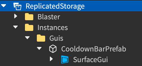
Cooldown meter
A cooldown meter is a UI component that informs players how long they have to wait before they're able to blast their blaster again. This slight pause prevents players from being able to blast as quickly as they can click or press a button, which is unrealistic for laser tag gameplay.
To exactly recreate the cooldown meter within the sample Laser Tag game:
Create a part to hold your
SurfaceGuiobject.- In the Explorer window, hover over the Workspace, then click the ⊕ icon. A contextual menu displays.
- From the contextual menu, insert a block part. This is a temporary location for the part so that you can visualize the changes in each step of the process.
Position and orient the part around the position of where a player's character would hold their blaster, then in the Properties window,
Set Transparency to 1 to make the part completely transparent.
Set Name to CooldownBarPrefab.
Set Size to
0.169, 0.027, 2.537to scale the part to a size about the length of the blaster.Disable CanCollide and CanQuery.

Insert a SurfaceGui into CooldownBarPrefab.
Select the new SurfaceGui, then in the Properties window,
Set Face to Top so the UI displays facing upward.
Set LightInfluence and MaxDistance to
0.Set PixelsPerStud to
200.
Create the black bar.
Insert an ImageLabel into the SurfaceGui.
Select the new label, then in the Properties window,
- Remove the default Image value.
- Set AnchorPoint to
0.5, 0.5to set the label's origin point in the middle of itself (50% from the left to the right of the label, and 50% from the top to the bottom of the label). - Set BackgroundColor3 to
0,0,0to set the label's background color to black. - Set BackgroundTransparency to
0.4to make the label's background semi-transparent. - Set Position to
{0.5, 0},{0.5, 0}to set the label at the middle of its container (50% from the left to the right of the parent SurfaceGui, and 50% from the top to the bottom of the parent SurfaceGui). - Set Size to
{1, 0},{1, 0}to widen the label to the whole part (100% horizontally and 100% vertically of the parent SurfaceGui). - Set Name to Container.

Round the corners of the container.
Insert a UICorner object into Container.
Select the UICorner, then in the Properties window, set CornerRadius to
0.15, 0to slightly round the corners.
Create the red bar.
- Insert an ImageLabel into Container.
- Select the new label, then in the Properties window,
- Remove the default Image value.
- Set AnchorPoint to
1, 0.5to set the label's origin point in the right-middle of itself (100% from the left to the right of the label, and 50% from the top to the bottom of the label). - Set BackgroundColor3 to
172, 13, 13to set the label's background color to a dark red. - Set BackgroundTransparency to
0.2to make the label's background slightly transparent. - Set Name to Bar.
- Set Position to
{1, 0},{0.5, 0}to set the label at the right-middle of its container (100% from the left to the right of the parent label, and 50% from the top to the bottom of the parent label). - Set Size to
{0, 0},{1, 0}to lengthen the label to the top of its parent label (0% horizontally and 100% vertically of the parent label). This step is also beneficial for the tweening behavior that occurs in the scripts in step 8.
Round the corners of the label.
- Insert a UICorner object into Bar.
- Select the UICorner, then in the Properties window, set CornerRadius to
0.15, 0to slightly round the corners.
Move CooldownBarPrefab to ReplicatedStorage.
Create a folder structure to organize your UI objects. The sample uses an Instances folder with a child Guis folder.

Move CooldownBarPrefab into Guis.
Reference the following
ReplicatedStoragescripts within the sample Laser Tag place file that programmatically attach the cooldown meter to the player's blaster, then animate the red bar after a player blasts their blaster.
FirstPersonBlasterVisuals
The following ReplicatedStorage.FirstPersonBlasterVisuals client script handles all visual logic for the player's first-person blaster. It requires a set of module scripts that work together to set up blaster visuals that feel more realistic for laser tag gameplay, including FirstPersonBlasterVisuals.addCooldownBar and FirstPersonBlasterVisuals.runCooldownBarEffect.
local Players = game:GetService("Players")
local ReplicatedStorage = game:GetService("ReplicatedStorage")
local Workspace = game:GetService("Workspace")
local RunService = game:GetService("RunService")

local BlastData = require(ReplicatedStorage.Blaster.BlastData)
local PlayerAttribute = require(ReplicatedStorage.PlayerAttribute)
local PlayerState = require(ReplicatedStorage.PlayerState)
local getBlasterConfig = require(ReplicatedStorage.Blaster.getBlasterConfig)

local runBlastVisuals = require(script.runBlastVisuals)
local setupAnimations = require(script.setupAnimations)
local addCooldownBar = require(script.addCooldownBar)
local runCooldownBarEffect = require(script.runCooldownBarEffect)

local laserBlastedBindableEvent = ReplicatedStorage.Instances.LaserBlastedBindableEvent

local RIG_OFFSET_FROM_CAMERA = CFrame.new(2, -2, -3) * CFrame.Angles(math.rad(0.25), math.rad(95.25), 0)

local localPlayer = Players.LocalPlayer
local currentCamera = Workspace.CurrentCamera

local rigModel = nil
local cooldownBar = nil
local animations = {}

local function addFirstPersonVisuals()
	local blasterConfig = getBlasterConfig()

	-- Add the first person rig
	rigModel = blasterConfig.RigModel:Clone()
	rigModel.Parent = Workspace

	-- Add the cooldownBar
	cooldownBar = addCooldownBar(rigModel.PrimaryPart.CooldownBarAttachment)

	animations = setupAnimations(blasterConfig, rigModel)
end

local function removeFirstPersonVisuals()
	for _, animation in animations do
		animation:Stop()
		animation:Destroy()
		animation = nil
	end
	if rigModel then
		-- This also destroys the cooldown bar since it is parented to the rig
		rigModel:Destroy()
		rigModel = nil
	end
end

-- Run first person visual effects when a blast occurs
laserBlastedBindableEvent.Event:Connect(function(blastData: BlastData.Type)
	runBlastVisuals(rigModel.PrimaryPart.TipAttachment, blastData, animations.blastAnimation)
	runCooldownBarEffect(cooldownBar)
end)

-- Bind the rig to the camera if it exists
RunService.RenderStepped:Connect(function()
	if rigModel then
		-- Update to rig's CFrame relative to the camera's position and RIG_OFFSET_FROM_CAMERA
		rigModel:PivotTo(currentCamera.CFrame * RIG_OFFSET_FROM_CAMERA)
	end
end)

-- Handles changing visuals when the blasterType changes while playing
localPlayer:GetAttributeChangedSignal(PlayerAttribute.blasterType):Connect(function()
	local playerState = localPlayer:GetAttribute(PlayerAttribute.playerState)
	if playerState == PlayerState.Playing then
		removeFirstPersonVisuals()
		addFirstPersonVisuals()
	end
end)

-- Handles changing visuals when the playerState changes
localPlayer:GetAttributeChangedSignal(PlayerAttribute.playerState):Connect(function()
	local newPlayerState = localPlayer:GetAttribute(PlayerAttribute.playerState)
	-- Remove the visuals when the player is selecting a blaster or is in the lobby
	if newPlayerState == PlayerState.SelectingBlaster or newPlayerState == PlayerState.InLobby then
		removeFirstPersonVisuals()
	-- Add the visuals back when the player finishes selecting the blaster.
	elseif newPlayerState == PlayerState.Playing then
		addFirstPersonVisuals()
	end
end)
addCooldownBar
The following FirstPersonBlasterVisuals.addCooldownBar module script attaches a new instance of the cooldown meter to the player's blaster. When a player selects a blaster, the script moves and welds the cooldown meter part to the blaster in a location that tilts the cooldown meter toward the camera.
local ReplicatedStorage = game:GetService("ReplicatedStorage")

local cooldownBarPrefab = ReplicatedStorage.Instances.Guis.CooldownBarPrefab

local function addCooldownBar(attachment: Attachment): Part
	local part = cooldownBarPrefab:Clone()

	-- Move and weld the cooldown bar part to the blaster
	part:PivotTo(attachment.WorldCFrame)

	local weld = Instance.new("WeldConstraint")
	weld.Part0 = attachment.Parent
	weld.Part1 = part
	weld.Parent = part

	-- Make sure the weld is setup prior to parenting to the blaster
	part.Parent = attachment.Parent

	return part
end

return addCooldownBar
runCooldownBarEffect
The following FirstPersonBlasterVisuals.runCooldownBarEffect module script handles the tweening visual effect that communicates the blaster is unable to blast again until the red bar is no longer visible. When a player blasts their blaster, the script sets Bar to the full width of Container, then tweens the size down to 0 for the duration of secondsBetweenBlasts. Once the size of Bar is 0, the player can blast again, and the entire process repeats.
For more information on blaster behavior, see Implement Blasters from the Gameplay Scripting curriculum.
local ReplicatedStorage = game:GetService("ReplicatedStorage")
local TweenService = game:GetService("TweenService")

local getBlasterConfig = require(ReplicatedStorage.Blaster.getBlasterConfig)

local END_SIZE = UDim2.fromScale(0, 1)
local EASING_DIRECTION = Enum.EasingDirection.In
local EASING_STYLE = Enum.EasingStyle.Quad

local function runCooldownBarEffect(part: Part)
	local bar = part.SurfaceGui.Container.Bar

	-- Set bar size to 1 (bar filled)
	bar.Size = UDim2.fromScale(1, 1)

	-- Tween the size to 0 (bar empty) for the duration of secondsBetweenBlasts
	local secondsBetweenBlasts = getBlasterConfig():GetAttribute("secondsBetweenBlasts")
	local tweenInfo = TweenInfo.new(secondsBetweenBlasts, EASING_STYLE, EASING_DIRECTION)
	local propertyTable = {
		Size = END_SIZE,
	}
	local tween = TweenService:Create(bar, tweenInfo, propertyTable)
	tween:Play()
end

return runCooldownBarEffect
Note
Now, whenever a player blasts their blaster, the cooldown bar animates to communicate when the player can blast again.
Create BillboardGui objects
In order to display UI elements within the 3D space that respond to scripting logic and always face each player's camera regardless of their viewing angle, such as player names or map markers, you can create a BillboardGui object as a child of a BasePart or Attachment that exists in the 3D space.
The sample laser tag game includes two separate BillboardGui objects within the ReplicatedStorage service:
- OtherPlayerIndicatorGuiPrefab - Displays a pink or green circle above each player's head when they are active in a round.
- TaggedOutIndicatorGuiPrefab - Displays above a player's head when they are tagged out of the round.
After you create a BillboardGui object, you can create and customize its child GuiObjects according to each container's purpose. To demonstrate, in the immediate sections that follow, you will learn how to implement UI elements for both indicator types within the sample laser tag game. You can adjust any part of the process to meet the specifications of your own game.
To create a BillboardGui object:
- In the Explorer window, hover over a
BasePartorAttachment, then click the ⊕ icon. A contextual menu displays. - From the contextual menu, insert a BillboardGui object.
- Rename the BillboardGui according to the context of its child UI elements.
- Repeat this process for every UI element you need to contextually display above players' heads.
Team indicator
A team indicator is a UI element that informs players which team other players in the round belong to so that they can easily differentiate between their allies and enemy team members. This information is important because the gameplay of a first-person shooter game requires players to make quick strategic decisions while they're in combat zones so that they don't get tagged out and lose the match.
<img width="90%" img src="https://prod.docsiteassets.roblox.com/assets/tutorials/user-interface-design/Section3/Team-Indicator-Intro.jpg" />To exactly recreate the team indicator within the sample Laser Tag game:
Insert a BillboardGui object into a temporary rig.
From the toolbar's Home or Avatar tab, click Character.
Select from the available options. The sample uses a R15 rig type, a feminine body shape, and a Rthro avatar. The rig displays both in the 3D viewport and in the Explorer window under the name Rig.
In the Explorer window, navigate to the rig's child Head mesh, then click the ⊕ icon. A contextual menu displays.
From the contextual menu, insert a BillboardGui.

Select the new BillboardGui, then in the Properties window,
Set LightInfluence to
0to prevent environmental light from affecting the color of the indicator.Set Name to OtherPlayerIndicatorPrefab.
Set Size to
{0, 10},{0, 10}to make the label significantly smaller.Set StudsOffsetWorldSpace to
0, 4, 0to position it above the rig's head.
Insert a Frame object into OtherPlayerIndicatorPrefab.
Select the new frame, then in the Properties window,
Set AnchorPoint to
0.5, 0.5to set the frame's origin point in the middle of itself (50% from the left to the right of the label, and 50% from the top to the bottom of the label).Set BackgroundColor3 to
255, 3, 0to set the frame's background color to red as a placeholder color.Set Position to
{0.5, 0},{0.5, 0}to set the frame to the middle of its container (50% from the left to the right of the parent BillboardGui, and 50% from the top to the bottom of the parent BillboardGui).Set Size to
{1, -2},{1, -2}to shorten the frame to the surface area of the BillboardGui.
Insert a UICorner object into Frame to completely round the corners.

Insert a UIStroke object into Frame to outline the circle of the indicator.

Move OtherPlayerIndicatorPrefab to ReplicatedStorage.
Reference the following
ReplicatedStoragescript within the sample Laser Tag 1A place file that programmatically displays the team indicator for every player in an active round unless they are on the enemy team and occluded.
OtherPlayerIndicatorGuiSetup
The following ReplicatedStorage.OtherPlayerIndicatorGuiSetup script runs when players spawn into the arena for an active round. It attaches the team indicator by calling the addIndicatorToCharacter() function, which locates the Head object of each player character participating in the round. If they don't already have a team indicator, the script then clones and adds the otherPlayerIndicatorPrefab UI to the character's Head, and sets the team indicator color to their team color.
If other players are on the same team, the team indicator always displays, even if they hide behind objects in the 3D space; if other players are on the enemy team, the team indicator only displays if there isn't an object in the 3D space to occlude them.
local Players = game:GetService("Players")
local ReplicatedStorage = game:GetService("ReplicatedStorage")

local localPlayer = Players.LocalPlayer
local otherPlayerIndicatorPrefab = ReplicatedStorage.Instances.Guis.OtherPlayerIndicatorPrefab

local characterSpawnConnectionsByPlayer: { [Player]: RBXScriptConnection } = {}
local playerAddedConnection: RBXScriptConnection?

local function removeIndicatorFromPlayer(player: Player)
	if not player.Character then
		return
	end

	local head = player.Character:WaitForChild("Head", 3)
	if not head then
		return
	end

	local gui = head:FindFirstChild(otherPlayerIndicatorPrefab.Name)
	if gui then
		gui:Destroy()
	end
end

local function addIndicatorToCharacter(otherCharacter: Model?)
	local otherPlayer = Players:GetPlayerFromCharacter(otherCharacter)
	if not otherPlayer then
		return
	end

	task.spawn(function()
		local otherHead = otherCharacter:WaitForChild("Head", 3)
		if not otherHead then
			return
		end

		-- Only add indicators to players participating in the round
		if not otherPlayer.Team then
			return
		end

		-- Avoid adding duplicate indicators, creating a new one only if it doesn't exist
		local gui = otherHead:FindFirstChild(otherPlayerIndicatorPrefab.Name)
		if not gui then
			gui = otherPlayerIndicatorPrefab:Clone()
			gui.Frame.BackgroundColor3 = otherPlayer.TeamColor.Color
			gui.Parent = otherHead
		end

		-- The indicator is always on top only if the player is friendly

		local isFriendly = otherPlayer.Team == localPlayer.Team
		gui.AlwaysOnTop = isFriendly
	end)
end

local function addIndicatorWhenCharacterSpawns(player: Player)
	if characterSpawnConnectionsByPlayer[player] then
		return
	end
	local connection = player.CharacterAdded:Connect(addIndicatorToCharacter)
	characterSpawnConnectionsByPlayer[player] = connection
end

local function stopSyncingIndicators()
	for _, connection in characterSpawnConnectionsByPlayer do
		connection:Disconnect()
	end
	table.clear(characterSpawnConnectionsByPlayer)

	if playerAddedConnection then
		playerAddedConnection:Disconnect()
		playerAddedConnection = nil
	end

	for _, player in Players:GetPlayers() do
		removeIndicatorFromPlayer(player)
	end
end

local function addIndicatorToPlayer(player: Player)
	if player == localPlayer then
		return
	end

	addIndicatorToCharacter(player.Character)
	addIndicatorWhenCharacterSpawns(player)
end

local function startSyncingIndicators()
	for _, player in Players:GetPlayers() do
		addIndicatorToPlayer(player)
	end

	if not playerAddedConnection then
		playerAddedConnection = Players.PlayerAdded:Connect(addIndicatorToPlayer)
	end
end

local function onLocalTeamChanged()
	local localTeam = localPlayer.Team
	if localTeam then
		startSyncingIndicators()
	else
		stopSyncingIndicators()
	end
end

localPlayer:GetPropertyChangedSignal("Team"):Connect(onLocalTeamChanged)
onLocalTeamChanged()
Note
Now, whenever a player's is in an active round, team indicators display over other players' heads unless they are on the enemy team and behind an object.
Tagged out indicator
A tagged out indicator is a UI element that informs players when other players are no longer active in the round and are in the process of respawning back to their spawn zone. This information is important because the gameplay of a first-person shooter game requires players to move onto their next target as soon as they tag out a player so that they don't become vulnerable in the arena by playing in the same location for too long.
<img width="90%" img src="https://prod.docsiteassets.roblox.com/assets/tutorials/user-interface-design/Section3/TOI-Intro.png" />To exactly recreate the tagged out indicator within the sample Laser Tag game:
Insert a BillboardGui object into a temporary rig so that you can visualize the changes in each step of the process.
From the toolbar's Home or Avatar tab, click Character.
Select from the available options. The sample uses a R15 rig type, a masculine body shape, and a Rthro avatar. The rig displays both in the 3D viewport and in the Explorer window under the name Rig.
In the Explorer window, navigate to the rig's child Head mesh, then click the ⊕ icon. A contextual menu displays.
From the contextual menu, insert a BillboardGui.

Select the new BillboardGui, then in the Properties window,
Set LightInfluence to
0to prevent environmental light from affecting the color of the indicator.Set Name to TaggedOutIndicatorGuiPrefab.
Set Size to
{3, 0},{0.5, 0}to widen the space for a label.Set StudsOffset to
0, 3.25, 0to position it above a player's head.
Insert an ImageLabel object into TaggedOutIndicatorGuiPrefab.
Select the new label, then in the Properties window,
- Set AnchorPoint to
0.5, 0.5to set the label's origin point in the middle of itself (50% from the left to the right of the label, and 50% from the top to the bottom of the label). - Set BackgroundTransparency to
1to make the label's background completely transparent. - Set Name to Frame.
- Set Position to
{0.5, 0},{0.5, 0}to set the label to the middle of its container (50% from the left to the right of the parent BillboardGui, and 50% from the top to the bottom of the parent BillboardGui). - Set Size to
{1, 0},{1, 0}to widen the label to the whole BillboardGui (100% horizontally and 100% vertically of the parent BillboardGui). - Set Image to
rbxassetid://14304826985to make the image a multi-directional fade. - Set ImageColor to
245, 46, 46to tint the label red.
- Set AnchorPoint to
Note
  To improve performance, you can skip the image asset and instead use a [`UIGradient`](/docs/uigradient) object with a custom transparency number sequence. To learn more about this fade technique, see [UI Appearance Modifiers - Gradient](/docs/roblox-ui-appearance-modifiers#gradient).


  <img src="https://prod.docsiteassets.roblox.com/assets/tutorials/user-interface-design/Section3/TOI-4.png" width="80%" />
Insert a TextLabel object into Frame.
Select the new label, then in the Properties window,
Set AnchorPoint to
0.5, 0.5to set the label's origin point in the middle of itself (50% from the left to the right of the label, and 50% from the top to the bottom of the label).Set BackgroundTransparency to
1to make the label's background completely transparent.Set Name to BodyTextLabel.
Set Position to
{0.5, 0},{0.5, 0}to set the label to the middle of its container (50% from the left to the right of the parent label, and 50% from the top to the bottom of the parent label).Set Size to
{0.85, 0},{0.7, 0}so the text can take up most of the fade area (85% horizontally and 70% vertically of the parent image label).Set FontFace to Montserrat to fit the futuristic aesthetic.
Set Weight to Bold to thicken the font.
Set Text to TAGGED.
Set TextColor3 to
255, 255, 255to make the text white.Enable TextScaled.

Move TaggedOutIndicatorGuiPrefab to ReplicatedStorage.
Reference the following
ServerScriptServicescripts within the sample Laser Tag 1A place file that programmatically display the tagged out indicator while a player is respawning back to their team's spawn zone.
SetupHumanoid
The following ServerScriptService.SetupHumanoid server script runs as soon as a player loads the game. It ensures that whenever a player's character is added to the data model, setupHumanoidAsync is called with their Humanoid.
local Players = game:GetService("Players")

local setupHumanoidAsync = require(script.setupHumanoidAsync)

local function onCharacterAdded(player: Player, character: Model)
	local humanoid = character:WaitForChild("Humanoid")
	setupHumanoidAsync(player, humanoid)
end

local function onPlayerAdded(player: Player)
	-- Call onCharacterAdded if the player already has a character
	if player.Character then
		onCharacterAdded(player, player.Character)
	end
	-- Call onCharacterAdded for all future character spawns for this player
	player.CharacterAdded:Connect(function(character: Model)
		onCharacterAdded(player, character)
	end)
end

-- Call onPlayerAdded for any players already in the game
for _, player in Players:GetPlayers() do
	onPlayerAdded(player)
end
-- Call onPlayerAdded for all future players
Players.PlayerAdded:Connect(onPlayerAdded)
setupHumanoidAsync
The following SetupHumanoid.setupHumanoidAsync module script configures settings on the player character's Humanoid that ensures that their name and health display during a round, as long as they aren't occluded. In addition, this script listens for the Died event in the player character's Humanoid when their health reaches zero.
Once a player is tagged out from their health reaching zero, the script disables BreakJointsOnDeath to prevent the default behavior of the character falling apart, then it runs all logic within setupHumanoidAsync.onHumanoidDied.
local onHumanoidDied = require(script.onHumanoidDied)

local function setupHumanoidAsync(player: Player, humanoid: Humanoid)
	-- Give each humanoid full control over its name/health display distance
	humanoid.DisplayDistanceType = Enum.HumanoidDisplayDistanceType.Subject

	-- Set name and health display distances to a sufficiently large value to show display name
	-- and health bar at any practical distance, as long as it is not occluded
	humanoid.NameDisplayDistance = 1000
	humanoid.HealthDisplayDistance = 1000
	humanoid.NameOcclusion = Enum.NameOcclusion.OccludeAll
	humanoid.HealthDisplayType = Enum.HumanoidHealthDisplayType.AlwaysOn

	-- Prevent character from falling apart when health is depleted
	humanoid.BreakJointsOnDeath = false

	humanoid.Died:Wait()
	onHumanoidDied(player, humanoid)
end

return setupHumanoidAsync
onHumanoidDied
The following setupHumanoidAsync.onHumanoidDied module script handles all of the logic when a player character's Humanoid is tagged out from a round. The script starts by changing the playerState toTaggedOut, which allows other scripts to trigger behavior for the player whose health reached zero, such as displaying the first-person respawn screen.
The script then clones and adds the tagged out indicator to the character's Head so other players know they are in the process of respawning back to their team's spawn zone. In addition, it adds an AlignOrientation instance to the character so that it doesn't fall over due to gravity or other players colliding with the character.
When the player respawns, their playerState becomes SelectingBlaster, automatically disabling the tagged out indicator. SetupHumanoidhandles calling setupHumanoidAsync, then the process starts again.
local ReplicatedStorage = game:GetService("ReplicatedStorage")

local PlayerState = require(ReplicatedStorage.PlayerState)
local PlayerAttribute = require(ReplicatedStorage.PlayerAttribute)
local taggedOutIndicatorGuiPrefab = ReplicatedStorage.Instances.Guis.TaggedOutIndicatorGuiPrefab

local function onHumanoidDied(player: Player, humanoid: Humanoid)
	-- Update player state to be tagged out except when they're in the lobby,
	-- which happens when they're tagged out right as the round ends
	if player:GetAttribute(PlayerAttribute.playerState) ~= PlayerState.InLobby then
		player:SetAttribute(PlayerAttribute.playerState, PlayerState.TaggedOut)
	end

	-- Add Tagged Out indicator to character
	local newIndicator = taggedOutIndicatorGuiPrefab:Clone()
	local character = humanoid.Parent
	newIndicator.Parent = character:FindFirstChild("Head")

	-- Add an AlignOrientation to the character to prevent it from falling over
	local alignOrientation = Instance.new("AlignOrientation")
	alignOrientation.RigidityEnabled = true
	alignOrientation.Mode = Enum.OrientationAlignmentMode.OneAttachment
	alignOrientation.Attachment0 = humanoid.RootPart.RootAttachment
	alignOrientation.CFrame = humanoid.RootPart.CFrame
	alignOrientation.Parent = humanoid.RootPart
end

return onHumanoidDied
Note
Now, whenever a player's health reaches zero, the tagged out indicator displays above their head until they respawn.
Congratulations on completing the User Interface Design Curriculum! Now that you have experience creating an art style, wireframing your layouts, and implementing your designs in Studio from start to finish, you can extend your project with new UI and functionality, or follow additional tutorial curricula, such as the Gameplay Scripting Curriculum that teaches you about the general organization and key implementation details of the sample laser tag game. Happy creating!