
Source: Roblox Creator Hub · CC BY 4.0 · View source · Code samples: MIT Imported 2026-10-03. Formatting adapted for this site.
Adaptive design guidelines
Adaptive design ensures your Roblox games look and feel great across various screen sizes, orientation, and input types. Moving beyond traditional device categories like mobile, desktop, and console, today's devices have far more dynamic capabilities, allowing for seamless transition between different inputs and displays. Imagine a tablet that supports multiple orientations (landscape and portrait), multiple input types (touch, gamepad, mouse and keyboard), and multiple display sizes (native display, and extending to a large TV).
These guidelines will help you deliver best-in-class games that intelligently adapt to any device and input type to reach a wide audience. For more details on workflows and APIs to assist with implementing these guidelines, see the cross‑platform development guide.
Note
To explore a pre-made game that showcases the following adaptive design concepts, check out the Interactivity Showcase.
Core principles
Every game is unique, but following a few key principles will help you deliver an intuitive and polished game to every player, on every device.
- Input fluidity — Make sure your UI works with various input types like gamepad, touch, keyboard, and VR controllers. This includes changing your UI layout and providing assistive hints depending on the input type.
- Responsive layout — Design UI layouts that automatically adjust to different screen sizes and orientations.
- Dynamic sizing — Scale UI elements as needed to fit various screen dimensions.
- Legibility and visual clarity — Make all UI components, including text and buttons, easily readable and visually clear.
Input fluidity
Ensure your game feels natural on various input devices, including gamepads, mouse/keyboard, touch, and VR.
- Design controls and shortcuts for multiple inputs — Make sure every action in your game can be triggered using gamepad buttons/D‑pad, keyboard shortcuts, and touch. Controls should be visually and functionally focusable for directional pad or stick navigation. Test each input mode so that core gameplay, menus, and UI are accessible and natural, regardless of device.
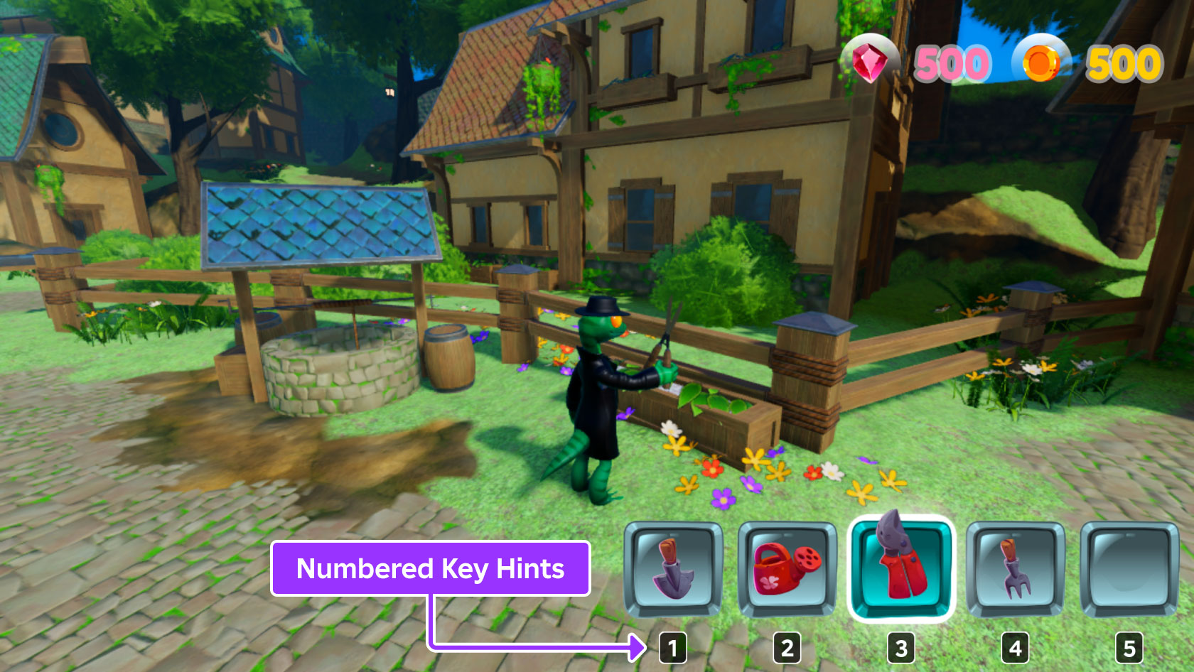
- Provide visual feedback by input type — Update UI labels, prompts, and tooltips to reflect the active input method, for example showing Press A on a gamepad, Pinch on touch, or ShiftA on keyboard. Use icons and language familiar to each platform's players.
Mouse/Keyboard
Touch

Gamepad

Responsive layout
The layout of your game UI should adapt to different screen sizes and orientation. On a big computer monitor, you have lots of space to show buttons all at once. On a small phone screen, however, all those buttons would look cramped and messy.
- Adapt layouts to screen size and orientation — Use responsive patterns so your UI rearranges or condenses appropriately. For example, move less‑important buttons into a collapsible menu ("hamburger"/menu button) on small screens, while showing them in full on desktops. Your game UI should adapt gracefully to both landscape and portrait orientation if it supports them.
- Implement layout components that react to parent size — Build UI panels and widgets that adjust size or position based on their parent container. For example, use split‑view layouts where side panels collapse on narrow screens but expand on wider ones.
Medium / Landscape

Small / Portrait

Dynamic sizing
This is about the size of your UI elements, not just their position. Your UI should scale up or down with the screen so everything stays the right size and is always easy to interact with.
- Support content-driven sizing and automatic wrapping — Implement auto‑sizing behaviors: let text boxes grow or shrink with content, and support automatic line wrapping so labels don't overflow or become unreadable as screen size changes.
- Expose and respect accessibility / user preferences — Allow your UI to respond to user‑specified text or UI scaling settings, tying those settings directly to UI element sizing so increased accessibility preferences always translate to larger, more readable UI.
Large

Medium

Small

Legibility & visual clarity
Can players actually read your text on a small phone screen or a larger TV that is far away from them? Are your buttons easy to see against the background of your 3D world?
- Choose font sizes and styles for small screens — Always select font sizes that are readable on mobile devices, not just desktop. Test on actual devices, and verify text is legible at the smallest expected size. Avoid excessively decorative or thin fonts.
- Ensure high contrast and clear visual hierarchy — Use colors for text and backgrounds that provide enough contrast to be readable in varying in‑game lighting conditions. Employ strong visual hierarchy and make key actions and labels stand out through size, color, or placement.
Final thoughts
Adaptivity is about meeting players where they are, whether in their hands, on their desk, or on the big screen. Roblox creators who build with these guidelines deliver meaningful, accessible, and fun cross‑platform games. Start adapting today and let your creations thrive!