Source: Roblox Creator Hub · CC BY 4.0 · View source · Code samples: MIT Imported 2026-10-03. Formatting adapted for this site.
Studio interface
Toolbar and mezzanine
The toolbar and mezzanine reside at the top of Studio.
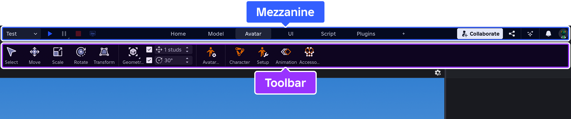
The left side of the mezzanine contains easily-accessible testing controls.

The right side of the mezzanine contains buttons/menus for collaboration, sharing, Assistant, creator notifications, and account options.

In the center of the mezzanine are the default tool tabs of Home, Model, Avatar, UI, Script, and Plugins. You can also add custom tabs for your specific needs.

Home
The Home tab contains the core transform tools, part inserter, the color and material widgets, the group and lock tools, and anchor toggle. Also contains the Terrain Editor.
Model
The Model tab contains the core transform tools, the pivot and align tools, insertion widgets for effects and constraints, and solid‑modeling tools.
Avatar
The Avatar tab contains the core transform tools, as well as specialized tools for building default rigs, configuring avatars, working with animations, and creating/fitting accessories.
UI
The UI tab contains insertion widgets for UI objects and lets you access the Style Editor, a comprehensive tool that allows you to create, manage, and apply UI styles.
Script
The Script tab contains tools for writing and testing scripts, including debugging tools.
Plugins
The Plugins tab contains plugins created by the community or plugins you've created yourself to use across your games.
Appearance
You can customize the appearance of the toolbar by right-clicking in an empty area within the mezzanine/toolbar and selecting from the following options:
Manage tabs — Reveals a popup window with the following options:
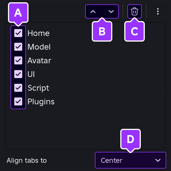
- Show or hide the tab.
- With a tab selected, reorder it relative to the other tabs.
- Delete a selected [custom tab](#custom-tabs).
- Choose between tabs **Center** alignment or **Left** alignment (next to the [testing controls](https://create.roblox.com/docs/studio/testing-modes#playtest-options)).
Collapse toolbar — Maximizes space by hiding the toolbar while keeping the mezzanine visible. Hovering over a tab in the mezzanine temporarily reveals the toolbar.
Compact toolbar — Makes the toolbar considerably more compact through smaller icons and labels, ideal for laptops or smaller monitors.
Show labels — Toggles the text labels below tools on or off.
Custom tabs
Beyond the default tool tabs, you can add custom tabs for your specific needs, either through Studio's interface or by editing local .json files.
Studio
The easiest way to create custom tabs is through Studio's workflow.
Click the + button to the right of the default tabs, then type in a name for the new tab and press Enter.

Note
Alternatively to creating a new, empty tab, you can duplicate any existing tab by right‑clicking it and selecting Duplicate tab. Unlike default tabs, tools within duplicated tabs can be freely modified.
Click the button or right‑click in an empty region of the toolbar and select Add tools.

In the popup window, search for a tool and toggle its checkbox to add. New tools appear to the right of other tools, but you can right‑click any tool and select Move left or Move right to reorder it relative to other tools. You can also insert a divider by right‑clicking in an empty region of the toolbar and selecting Add divider.

Note
If you need to remove a tool from a custom tab, right‑click it and select Remove tool.
JSON
Custom tab configurations are saved locally on each machine in .json format, allowing you to build customized tabs and share them with your team or the community.
To modify .json from a default tab toolset, begin by right‑clicking an existing tab and selecting Duplicate tab.
Open the custom tabs folder which is stored in a location unaffected by Studio updates.
- Windows —
%LOCALAPPDATA%\Roblox\<userID>\CustomRibbonTabs - Mac —
~/Documents/Roblox/<userID>/CustomRibbonTabs
- Windows —
In the
CustomRibbonTabsdirectory are.jsonfiles which define the toolbar's structure:The
RibbonLayout.jsonfile controls the overall ordering and visibility of tabs.{ "TabLayout": [ { "Identifier": { "Type": "BuiltIn", "Filename": "HomeTab" }, "Visible": true }, {Other
.jsonfiles represent individual tabs and can be named whatever you prefer. Each file'sNamerepresents the tab's name as it will appear in Studio.{ "Name": "Custom", "Controls": [ ] }
In the
Controlsarray for a tab file, insert various buttons, submenus, and more. Each control'sIdvalue must be unique within the file.The following examples illustrate common elements in a custom tab:
IconButton
`IconButton` inserts a button with an optional text label.

```json title="CustomTab.json"
{
	"Name": "Custom",
	"Controls": [
		{
			"Id": "Select",
			"Type": "IconButton",
			"Action": {
				"Category": "Actions",
				"DataModel": "Standalone",
				"ItemId": "Select",
				"PluginId": "BuilderTools"
			}
		},
	]
}
```
Separator
`Separator` inserts a non-interactable separation line. `Size` options are `Large`, `Medium`, or `Small`.

```json title="CustomTab.json"
{
	"Name": "Custom",
	"Controls": [
		{
			"Type": "Separator",
			"Size": "Large"
		},
	]
}
```
SplitButton
`SplitButton` inserts a button which reveals a dropdown menu when the small triangle to the right of its icon is pressed.

```json title="CustomTab.json"
{
	"Name": "Custom",
	"Controls": [
		{
			"Id": "SimpleSplit",
			"Type": "SplitButton",
			"Action": {
				"Category": "Actions",
				"DataModel": "Standalone",
				"ItemId": "Select",
				"PluginId": "BuilderTools"
			},
			"Children": [
				{
					"Type": "Column",
					"Children": [
						{
							"Id": "Move",
							"Type": "Option",
							"Action": {
								"Category": "Actions",
								"DataModel": "Standalone",
								"ItemId": "Move",
								"PluginId": "BuilderTools"
							}
						},
						{
							"Id": "Scale",
							"Type": "Option",
							"Action": {
								"Category": "Actions",
								"DataModel": "Standalone",
								"ItemId": "Scale",
								"PluginId": "BuilderTools"
							}
						},
						{
							"Id": "Rotate",
							"Type": "Option",
							"Action": {
								"Category": "Actions",
								"DataModel": "Standalone",
								"ItemId": "Rotate",
								"PluginId": "BuilderTools"
							}
						},
					]
				}
			]
		}
	]
}
```
IconButton (Plugin)
`IconButton` can be used to insert a button which links to a [plugin](/docs/roblox-studio-plugins) through its ID, assuming the plugin, such as [Tailor Swiftly](https://create.roblox.com/store/asset/130172194397869/Tailor-Swiftly), is installed in your version of Studio.

```json title="CustomTab.json"
{
	"Name": "Custom",
	"Controls": [
		{
			"Id": "PrinceTybalt_Tailor Swiftly",
			"Type": "IconButton",
			"Action": {
				"Category": "Actions",
				"DataModel": "Edit",
				"ItemId": "PrinceTybalt_Tailor Swiftly",
				"PluginId": "130172194397869",
				"PluginType": "Cloud"
			}
		}
	]
}
```
Text
`Text` inserts a basic text label, useful to label groups of other controls in submenus.

```json title="CustomTab.json"
{
	"Name": "Custom",
	"Controls": [
		{
			"Id": "CustomHeader",
			"Type": "Text",
			"Title": "Insert UI"
		},
	]
}
```
Note
Beyond the above examples, you can right-click any default tab and select **Duplicate tab**. This will create a new custom tab and corresponding `.json` file in your local `CustomRibbonTabs` directory which you can inspect to explore how various default tools and menus are constructed.Save the
.jsonfile and then reload Studio's plugins:Right-click anywhere in the toolbar or mezzanine and select Manage tabs.
Access the options menu from the popup's upper‑right corner and select Reload custom tabs.

3D viewport
The 3D viewport represents the Workspace of a place. From here, you can move the camera around the virtual world, manipulate objects with the mouse, and playtest a game without leaving Studio.
<img
	src="https://prod.docsiteassets.roblox.com/assets/studio/general/Editor-Window.jpg"
	width="100%" alt="An example viewport display of a desert environment with multiple stone pillars. One of the pillars displays movement visual aids from the Move tool." />
3D viewport in Roblox Studio
Camera controls
Inside the viewport, you can move the camera with the following controls.
| Keys/Shortcuts | Action |
|---|---|
| W A S D | Moves the camera forward/left/back/right. |
| Q E | Moves the camera down/up. |
| Shift | In combination with any movement key, changes the camera speed. |
| F | Focuses the camera on a selected part. |
| **Right Mouse Button** | When pressed, dragging the mouse moves the camera view around. |
| **Mouse Scroll Wheel** Ctrl= or ⌘= Ctrl- or ⌘- or O | Zooms the camera in or out. Zooms the camera in. Zooms the camera out. |
| , / . | Rotates the camera left/right. If a part/model is in focus via the F shortcut, rotates the camera counterclockwise/clockwise around that focused object. |
| **Middle Mouse Button** | When pressed, dragging the mouse pans the camera. |
| **Right Mouse Button** & **Mouse Scroll Wheel** | Pressing the right mouse button and scrolling the mouse wheel **up** increases the camera scroll speed. Conversely, pressing the right mouse button and scrolling the mouse wheel **down** reduces the camera scroll speed. Note This feature is currently in beta. Enable it through File ⟩ Beta Features ⟩ New Studio Camera Controls. |
Object selection
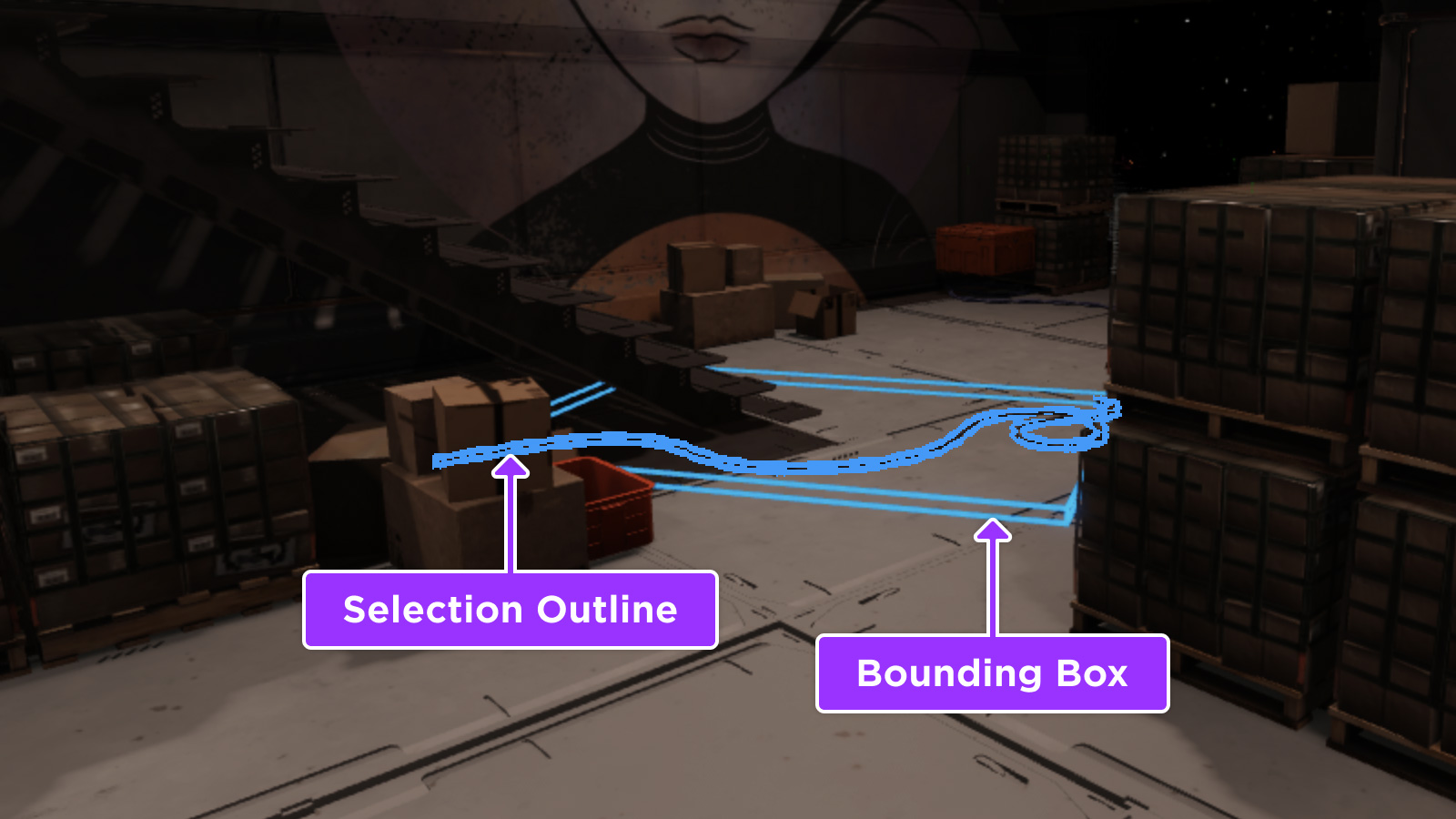
As you hover over parts and models in the viewport, they are outlined to indicate their potential selection. You can select an outlined object by clicking it, or you can select multiple objects by holding Shift, Ctrl, or ⌘ as you hover over and click them.
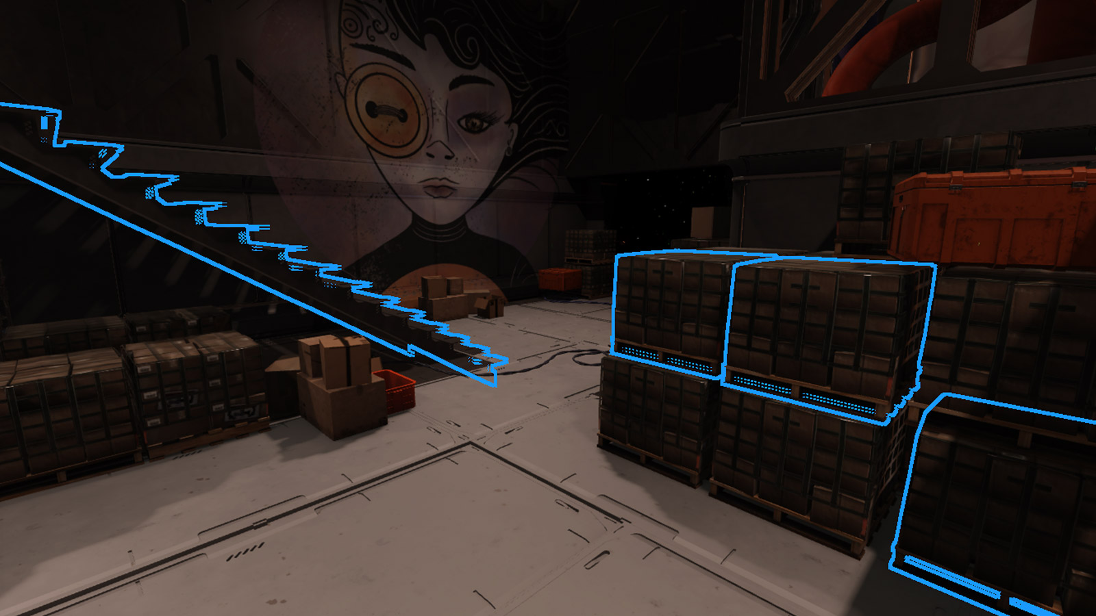
In more complex environments or when zoomed in, objects will commonly be hidden from your view by other objects in front. To select hidden objects without moving the camera around, hold Alt or ⌥ and click to perform selection cycling to the next further object behind the currently selected object.
Note
When one or more objects or models are selected in the Explorer window, you can select all of their children by right-clicking and choosing Hierarchy ⟩ Select Children from the context menu. Similarly, choosing Select Parent(s) selects the direct parents of those objects.
To customize the appearance of selection lines and boxes around objects, set your desired options in the Selection Visualization section within the Selection panel of Studio's settings.
Visualization options
In the upper-right corner of the 3D viewport, you can quickly toggle or set common visualization options related to on‑screen UI overlays, light sources, physics simulation, character pathfinding, and more. The menu also contains a control for viewing/setting the camera scroll speed.

Frequently-used tools
Commonly used windows include the Explorer, the Properties window, Asset Manager, Toolbox, and others.
Explorer
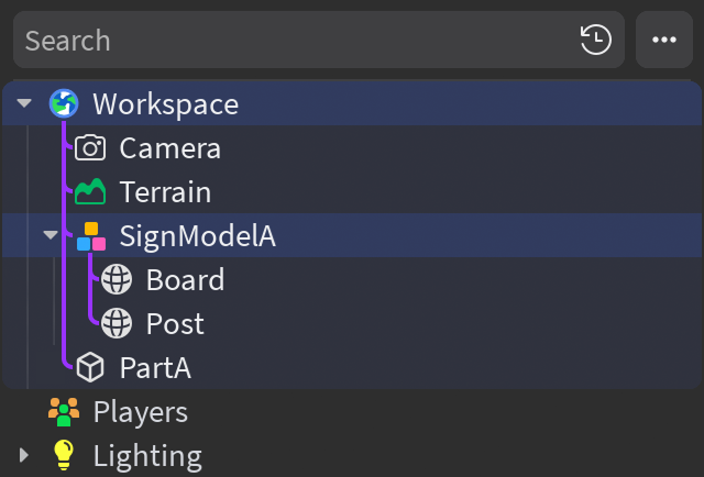
The Explorer window, visible by default and accessible from Studio's Window menu or Home tab, shows a hierarchical list of every object and service inside the place, collectively referred to as its data model. Frequently used services in the hierarchy include Workspace which mirrors the 3D viewport, as well as ReplicatedStorage and ServerStorage.
Properties
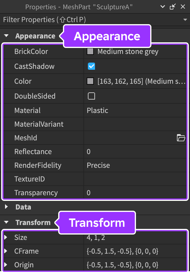
The Properties window, visible by default and accessible from Studio's Window menu or Home tab, lets you adjust properties of a selected object to change how it looks and behaves. Object properties are divided into sections; for example, a MeshPart includes sections like Appearance which allows you to change its color, material, transparency, and more.
At the bottom of the window, you can define custom attributes for an object, similar to its default properties. Attributes and their values are saved with your place/assets and they're an ideal way for team members to experiment with different values during runtime, even if they don't understand the underlying code.

Asset Manager
The Asset Manager, accessible from Studio's Window menu or Home tab, lets you manage places, images, meshes, audio, and more. It also provides a mechanism to bulk import large groups of assets.
Toolbox
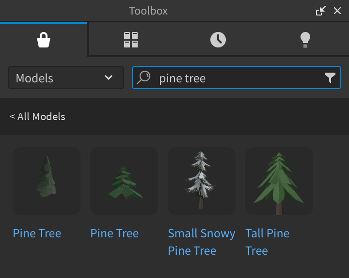
The Toolbox, accessible from Studio's Window menu or Home tab, contains a selection of models, images, meshes, audio, plugins, videos, and fonts made by Roblox or Roblox community members. It also includes all of the creations that you've personally distributed on the Creator Store or those which were distributed by groups you belong to.
Output
The Output window, accessible from Studio's Window menu or Script tab, displays errors captured from running scripts, messages from Roblox Engine, messages from calls to LuaGlobals.print(), and errors from calls to RobloxGlobals.warn().
Command Bar
The Command Bar, accessible from Studio's Script tab toolbar or the Window ⟩ Script menu, lets you execute Luau code outside of scripts. To quickly jump to the command bar at any time, press Ctrl9 (Windows) or ⌘9 (Mac).
Note
Most of the features outlined below are in beta and must be enabled through File ⟩ Beta Features ⟩ Multi-line Command Bar.

Features include:
Multiline editing — Press Enter to insert new lines while typing. The bar starts with 2 lines, grows up to 10 lines as new lines are inserted, and shrinks as lines are deleted. When you're ready to run/execute the contents of the bar, click the Run button or use the shortcut CtrlEnter (⌘Enter).
Command history — The last 10 executed commands are visible by clicking the History button and navigating to the Recent tab. Clicking on a command in the list loads it into the bar, or you can navigate the list with ↑/↓ and insert the highlighted command with Enter. Alternatively, you can scrub through commands with
Ctrl/⌘ + ↑/↓ when the command bar is selected.
Saved commands — You can explicitly save commands with the Save button or the default shortcut CtrlB (⌘B). Saved commands can be accessed through the Saved tab in the popup list, and the mechanics of loading saved commands from the list are the same as those in the command history.
Script Editor integration — The command bar is an embedded script editor and supports a wide subset of Studio's Script Editor features, including autocomplete, Luau linting, go to declaration, function filter, Code Assist, and multi‑cursor.
Layout customization
Studio's drag-and-drop interface lets you easily customize window layout to best suit your workflows.
Reposition windows
You can reposition any window by click-dragging its header bar. As you begin dragging the window, the interface reveals empty docking area regions. If you drag the mouse pointer into any empty region, a floating position selector appears in that region. Dragging the pointer over the "center" of the floating selector targets the empty region as the dragged window's destination, indicated by the region darkening and becoming outlined.
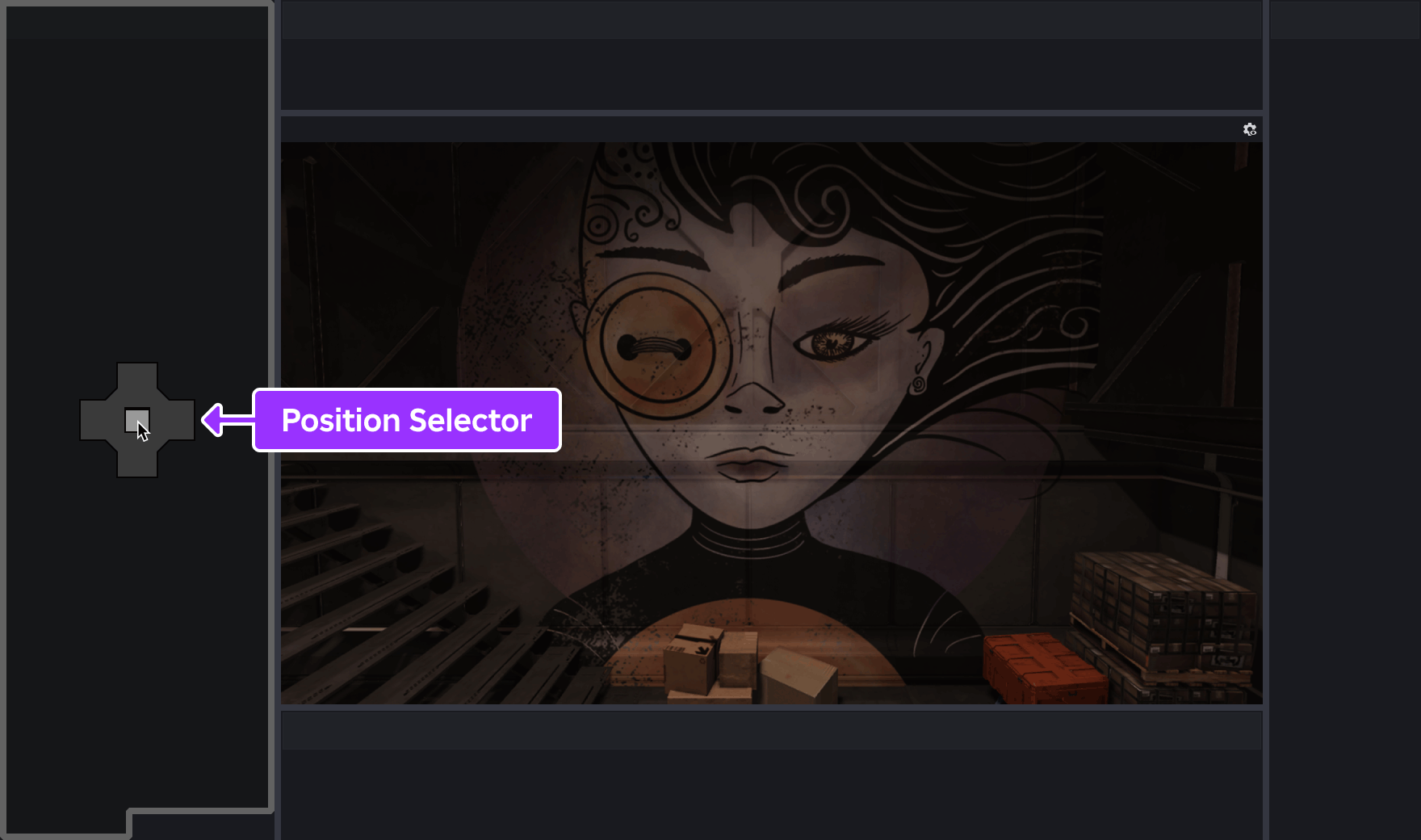
Mouse pointer hovering over the "center" icon of the position selector in an empty docking area
If you drag the mouse pointer into a populated region such as the 3D viewport, a floating position selector appears with multiple options for the window's destination. For example, dragging the pointer over the "left" icon will position the window on the region's left side.
Viewport left
<img src="https://prod.docsiteassets.roblox.com/assets/studio/general/Docking-Position-Selector-Left.png" width="880" height="520" alt="Mouse pointer hovering over the 'left half' icon of the position selector in a populated region, showing the left side of the region as the dragged window's destination." />Viewport right
<img src="https://prod.docsiteassets.roblox.com/assets/studio/general/Docking-Position-Selector-Right.png" width="880" height="520" alt="Mouse pointer hovering over the 'right half' icon of the position selector in a populated region, showing the right side of the region as the dragged window's destination." />Group windows
If you drag a window into a populated region and choose the "center" icon of the position selector, the dragged window will group into that region as a tab. This allows you to set up tab groups of commonly used windows.
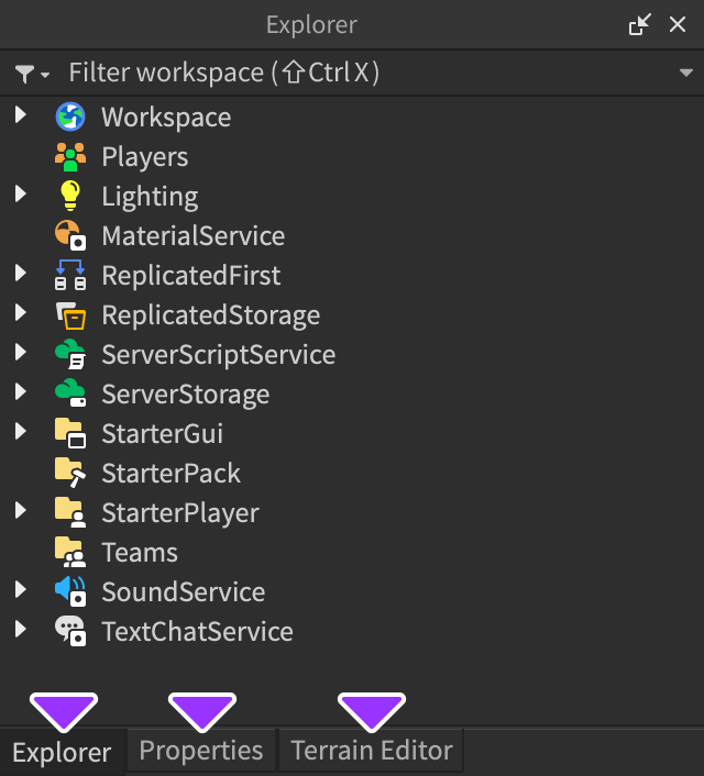
Three windows grouped together as tabs
Pin windows
To maximize screen space for the 3D viewport, you can pin windows (or an entire group of windows) to the edges of the overall Studio window. Once pinned, you can temporarily open any window by clicking its tab — this does not disturb other windows, and the expanded window will automatically collapse when you click in another window or click its tab again.

Three windows pinned to the right side of the Studio window
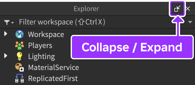
To pin a window or an entire group of windows, click the "collapse" button. Alternatively, to un‑pin a pinned window/group, open it by clicking its tab, then click the "expand" button.
Float windows
To float a window freely of other windows, simply drag‑and‑drop it without selecting any icon from the floating position selector.