
Source: Roblox Creator Hub · CC BY 4.0 · View source · Code samples: MIT Imported 2026-10-03. Formatting adapted for this site.
UI appearance modifiers
By utilizing appearance modifiers, you can further customize the appearance of your GuiObjects.
- Apply a gradient to the background of an object.
- Apply a stroke to text or a border.
- Set rounded corners for an object.
- Increase padding between the borders of an object.
- Add a drop shadow behind an object.
Gradient
The UIGradient object applies a color and transparency gradient to its parent GuiObject.
	<img src="https://prod.docsiteassets.roblox.com/assets/ui/ui-objects/UIGradient-Example.png" width="480" />


	<img src="https://prod.docsiteassets.roblox.com/assets/studio/explorer/UIGradient.png" width="320" />
You can configure the gradient by:
- Setting its colors through a
ColorSequencein the gradient'sColorproperty. - Setting its transparency through a
NumberSequencein the gradient'sTransparencyproperty. - Choosing the gradient's type through the
Typeproperty. - Choosing the gradient's starting point (inside or outside the parent's bounds) through the
Offsetproperty. - Choosing the gradient's angle through the
Rotationproperty. - Choosing the gradient's scale through the
Scaleproperty. - Choosing the gradient's edge sampling behavior through the
TileModeproperty.
Color sequence
To set a gradient's color sequence:
In the Explorer window, select the
UIGradient.In the Properties window, click inside the
Colorproperty field, then click the ⋯ button to the right of the input box.
Each triangle on the bottom axis of the color sequence is a keypoint that determines the color value at that point.
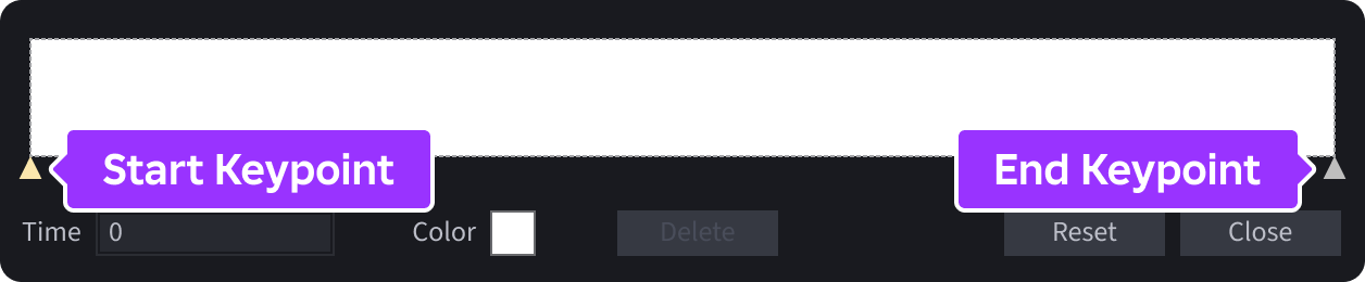
- Click a keypoint in the color sequence to select or reposition it, or add another keypoint by clicking anywhere on the graph.
- Click the small square next to Color to open the Colors pop-up window, then select the desired color for the keypoint.
- If needed, repeat these steps to add/adjust colors across the graph.
Transparency
To adjust a gradient's transparency across its range:
In the Explorer window, select the
UIGradient.In the Properties window, click inside the
Transparencyproperty field, then click the ⋯ button to the right of the input box.
Each square across the number sequence graph is a keypoint that determines the transparency value at that point.

- Click a keypoint in the number sequence to select or reposition it, or add another keypoint by clicking anywhere on the graph.
- Enter a specific time/value combination through the Time and Value inputs.
- If needed, repeat these steps to add/adjust transparency levels across the graph.
Type
A gradient's Type property sets its type from among Linear, Radial, or Conical.
Linear— The color/transparency sequence transitions in a straight line across the element. The direction is controlled by its rotation and the position by its offset. This is the default.Radial— The color/transparency sequence radiates outward from the element's center, optionally shifted byOffset. The radius is defined by the average of the element's width and height divided by two, effectively $\text{(width+height)/4}$.Rotationhas no effect on a radial gradient.Conical— The color/transparency sequence sweeps clockwise around the center of the element, optionally shifted byOffset.Rotationcontrols the starting and ending angle of the sweep. By default this sweeps from0to360degrees, butScalevalues less than1can reduce that angle.
<img src="https://prod.docsiteassets.roblox.com/assets/ui/ui-objects/UIGradient-Type-Radial.png" width="376" /><img src="https://prod.docsiteassets.roblox.com/assets/ui/ui-objects/UIGradient-Type-Conical.png" width="376" />Offset and rotation
The Offset and Rotation properties let you adjust the gradient's control points and its angle. As illustrated in the following diagrams, Offset is based on a percentage of the parent's width or height, and both positive or negative values are valid.
<img src="https://prod.docsiteassets.roblox.com/assets/ui/ui-objects/UIGradient-Offset-X-0.png" width="376" />Offset.X = 0
<img src="https://prod.docsiteassets.roblox.com/assets/ui/ui-objects/UIGradient-Offset-X-Pos-0.25.png" width="376" />Offset.X = 0.25
<img src="https://prod.docsiteassets.roblox.com/assets/ui/ui-objects/UIGradient-Offset-X-Neg-0.25.png" width="376" />Offset.X = -0.25
Similarly, when you rotate the gradient, the control points also rotate:
<img src="https://prod.docsiteassets.roblox.com/assets/ui/ui-objects/UIGradient-Rotation-0.png" width="376" />Rotation = 0
<img src="https://prod.docsiteassets.roblox.com/assets/ui/ui-objects/UIGradient-Rotation-Pos-45.png" width="376" />Rotation = 45
<img src="https://prod.docsiteassets.roblox.com/assets/ui/ui-objects/UIGradient-Rotation-Neg-90.png" width="376" />Rotation = -90
Scale
A gradient's Scale multiplies the extent of the gradient, controlling how much of the color/transparency sequence is visible within the element.
When
Scaleis less than1, the gradient spans less than the full extent. The remaining color/transparency is filled in according to theTileModeproperty.When
Scaleis greater than1, the gradient spans more than the full extent and only a part of the color/transparency is visible.
Scale = 1
<img src="https://prod.docsiteassets.roblox.com/assets/ui/ui-objects/UIGradient-Scale-0.25.png" width="376" />Scale = 0.25
<img src="https://prod.docsiteassets.roblox.com/assets/ui/ui-objects/UIGradient-Scale-1.8.png" width="376" />Scale = 1.8
Tile Mode
The TileMode property sets how the gradient repeats when the full sequence does not fully cover the parent element.
Clamp— Default mode where the color/transparency values at the start and end of the sequence extend infinitely, so the start values fill any area before the gradient and the end values fill any area after it.Repeat— The gradient repeats by wrapping the color/transparency sequence tiles seamlessly from end back to start. This can produce a visible seam if the first and last color/transparency values in the sequence differ.Mirror— The gradient reflects at each boundary so the color/transparency sequence ping‑pongs. This produces a smooth repetition with no seam, since the direction reverses at each tile edge.
<img src="https://prod.docsiteassets.roblox.com/assets/ui/ui-objects/UIGradient-TileMode-Repeat.png" width="376" /><img src="https://prod.docsiteassets.roblox.com/assets/ui/ui-objects/UIGradient-TileMode-Mirror.png" width="376" />Stroke
The UIStroke instance applies an outline to text or a border. Key features include:
- Adjustable color and thickness of the stroke outline.
- Ability to set the stroke transparency independently of the parent's transparency.
- Customizable position and/or offset relative to the parent's border.
- Three corner styles (round, bevel, or miter).
- Stroke gradient support through the
UIGradientinstance.
Thickness
You can set the stroke width through the Thickness property which is measured in pixels (default) or scaled relative to the parent, depending on the modifier's StrokeSizingMode. If stroke is on text and StrokeSizingMode is set to ScaledSize, thickness is relative to the font size.
<img src="https://prod.docsiteassets.roblox.com/assets/ui/ui-objects/UIStroke-Thickness-4.png" /><img src="https://prod.docsiteassets.roblox.com/assets/ui/ui-objects/UIStroke-Thickness-12.png" />UIStroke.Thickness = 12
Note
Avoid tweening the Thickness property of a UIStroke instance applied to text objects. This renders and stores many glyph sizes each frame, potentially causing performance issues or text flickering.
Color or gradient
You can set the stroke color through the Color property, as well as insert a child UIGradient instance to create gradient strokes.
<img src="https://prod.docsiteassets.roblox.com/assets/ui/ui-objects/UIStroke-Color-Solid.png" />UIStroke.Color = (0, 95, 225)
<img src="https://prod.docsiteassets.roblox.com/assets/ui/ui-objects/UIStroke-Color-Gradient.png" />UIStroke with UIGradient child
Note
Both the parent object and UIStroke can have child UIGradient instances, letting you set gradients on the stroke and fill independently.
Text outline or border
Depending on its parent type, UIStroke operates as either a text outline or as a border. When you parent UIStroke to a text object like TextLabel, it applies to the text's outline; when you parent UIStroke to other GuiObjects, it applies to the border.
<img src="https://prod.docsiteassets.roblox.com/assets/ui/ui-objects/UIStroke-As-Text-Outline.png" /><img src="https://prod.docsiteassets.roblox.com/assets/ui/ui-objects/UIStroke-As-Border.png" />Frame with UIStroke and UICorner children
When applied to a text object, you can override the default stroke behavior by the ApplyStrokeMode property, letting you apply the stroke to the object's bounds instead of the text itself. You can even control the text outline and border independently by parenting two UIStroke instances to a text object, one set to Contextual and the other to Border.
<img src="https://prod.docsiteassets.roblox.com/assets/ui/ui-objects/UIStroke-As-Text-Outline.png" />UIStroke.ApplyStrokeMode = Contextual
<img src="https://prod.docsiteassets.roblox.com/assets/ui/ui-objects/UIStroke-Stroke-Mode-Border.png" />UIStroke.ApplyStrokeMode = Border
Border position/offset
BorderStrokePosition sets the stroke's position relative to its parent's border and BorderOffset lets you specify an additional offset to the stroke's position.
<img src="https://prod.docsiteassets.roblox.com/assets/ui/ui-objects/UIStroke-BorderStrokePosition-Center.png" width="312" /><img src="https://prod.docsiteassets.roblox.com/assets/ui/ui-objects/UIStroke-BorderStrokePosition-Inner.png" width="312" /><img src="https://prod.docsiteassets.roblox.com/assets/ui/ui-objects/UIStroke-BorderStrokePosition-Outer.png" width="312" /><img src="https://prod.docsiteassets.roblox.com/assets/ui/ui-objects/UIStroke-BorderOffset-Out.png" width="312" />BorderOffset = (0.15, 0)
<img src="https://prod.docsiteassets.roblox.com/assets/ui/ui-objects/UIStroke-BorderOffset-In.png" width="312" />BorderOffset = (0, -16)
Transparency
The Transparency property sets the stroke transparency independently of the parent object's BackgroundTransparency or TextTransparency. This allows you to render text and borders that are "hollow" (consisting of only an outline).
<img src="https://prod.docsiteassets.roblox.com/assets/ui/ui-objects/UIStroke-Transparency-A.png" />TextLabel.TextTransparency = 0UIStroke.Transparency = 0.5
<img src="https://prod.docsiteassets.roblox.com/assets/ui/ui-objects/UIStroke-Transparency-B.png" />TextLabel.TextTransparency = 1UIStroke.Transparency = 0
Corner style
The LineJoinMode property lets you control how corners are interpreted. It accepts a value of either Round, Bevel, or Miter.
<img src="https://prod.docsiteassets.roblox.com/assets/ui/ui-objects/UIStroke-LineJoinMode-Round.png" /><img src="https://prod.docsiteassets.roblox.com/assets/ui/ui-objects/UIStroke-LineJoinMode-Bevel.png" /><img src="https://prod.docsiteassets.roblox.com/assets/ui/ui-objects/UIStroke-LineJoinMode-Miter.png" />Layering
To layer multiple sibling UIStroke instances on a GuiObject from front to back, you can utilize the ZIndex property. Those with a lower ZIndex render under (behind) those with a higher ZIndex.
Note that the rendering order for UIStroke instances with the same ZIndex is undefined. Do not apply multiple UIStroke instances with the same index if their rendering order matters.
Corners
The UICorner instance applies deformation to the corners of its parent GuiObject. You can control the applied radius through the CornerRadius property using either Scale or Offset.
Scale rounds the corners to a percentage based on the total length of the shortest edge of the parent, meaning that a scale of 0.5 or higher deforms the parent into a "pill" shape, regardless of its width or height. Offset rounds the corners to a specific number of pixels, regardless of the width/height of the parent.
<img src="https://prod.docsiteassets.roblox.com/assets/ui/ui-objects/UICorner-Scale-0.25.png" width="392" /><img src="https://prod.docsiteassets.roblox.com/assets/ui/ui-objects/UICorner-Scale-0.5.png" width="392" /><img src="https://prod.docsiteassets.roblox.com/assets/ui/ui-objects/UICorner-Offset-32.png" width="392" />
<center>
<img src="https://prod.docsiteassets.roblox.com/assets/ui/ui-objects/UICorner-Offset-64.png" width="392" />
<center>
You can also control individual corners through the TopLeftRadius, TopRightRadius, BottomRightRadius, and BottomLeftRadius properties.
<img src="https://prod.docsiteassets.roblox.com/assets/ui/ui-objects/UICorner-Mixed-1.png" width="392" />TopLeftRadius = (0, 0)TopRightRadius = (0, 48)BottomRightRadius = (0, 48)BottomLeftRadius = (0, 0)
Padding
A UIPadding object applies top, bottom, left, and/or right padding to the contents of the parent GuiObject. For example, you can move the text inside a text label downward or upward by applying an offset to the modifier's PaddingBottom property.
<img src="https://prod.docsiteassets.roblox.com/assets/ui/ui-objects/UIPadding-PaddingBottom-Default.png" width="300" /><img src="https://prod.docsiteassets.roblox.com/assets/ui/ui-objects/UIPadding-PaddingBottom-Offset-Negative.png" width="300" />PaddingBottom = (0, -20)
<img src="https://prod.docsiteassets.roblox.com/assets/ui/ui-objects/UIPadding-PaddingBottom-Offset-Positive.png" width="300" />PaddingBottom = (0, 30)
Shadow
A UIShadow object renders a drop shadow behind its parent UI instance. Key features include:
- Adjust the shadow's bluriness.
- Adjust the shadow's color and transparency.
- Adjust the shadow's offset and spread.
- If the parent is rotated by
GuiObject.Rotation, the shadow will also be rotated. - If the parent has round corners, the shadow will also have round corners.
Note
UIShadow does not support text. If you add this modifier to a TextLabel or TextButton, it renders a shadow of the object's rectangular bounding area, not of the text.
Bluriness
The BlurRadius property determines the shadow's blurriness. A larger value makes the shadow's edges appear softer. Note that the scale factor of this UDim property is relative to the parent's width or height, whichever is shorter.
<img src="https://prod.docsiteassets.roblox.com/assets/ui/ui-objects/UIShadow-BlurRadius-Scale-0.png" width="424" />BlurRadius = (0, 0)
<img src="https://prod.docsiteassets.roblox.com/assets/ui/ui-objects/UIShadow-BlurRadius-Scale-0.75.png" width="424" />BlurRadius = (0.75, 0)
Color and transparency
The Color property determines the shadow's color, while Transparency sets the shadow's transparency with 0 being fully opaque and 1 being fully transparent.
<img src="https://prod.docsiteassets.roblox.com/assets/ui/ui-objects/UIShadow-Color-White-Transparency-0.6.png" width="424" />Color = (255, 255, 255) · Transparency = 0.6
<img src="https://prod.docsiteassets.roblox.com/assets/ui/ui-objects/UIShadow-Color-Maroon-Transparency-0.png" width="424" />Color = (50, 0, 35) · Transparency = 0
Offset and spread
The Offset property moves the shadow relative to the parent's position, while Spread expands or shrinks the shadow relative to the parent's size.
<img src="https://prod.docsiteassets.roblox.com/assets/ui/ui-objects/UIShadow-Offset-Offset.png" width="424" />Offset = {0, -14}, {0, 6}
<img src="https://prod.docsiteassets.roblox.com/assets/ui/ui-objects/UIShadow-Offset-Scale.png" width="424" />Offset = {0.1, 0}, {-0.15, 0}
<img src="https://prod.docsiteassets.roblox.com/assets/ui/ui-objects/UIShadow-Spread-Offset.png" width="424" />Spread = {0, 10}, {0, 10}
<img src="https://prod.docsiteassets.roblox.com/assets/ui/ui-objects/UIShadow-Spread-Scale.png" width="424" />Spread = {0.3, 0}, {0.3, 0}